17 Creative Writing Portfolio Examples & How to Create Yours
Just as you need inspiration for writing, it also helps with putting together your writing portfolio. In the last 6 years, we’ve seen thousands of writer websites, and we collected 17 of the best creative writing portfolios for you.
They’re portfolio websites from different kinds of creative writers: some do poetry, some scriptwriting, some copywriting… One thing is for sure though: you’ll leave with ideas, excitement, and a clear vision of how to make your ideas come to life in your own portfolio.
Read until the end because we'll also show you how you can build yours easily, in 5 simple steps.
17 creative writing portfolio examples & why they’re excellent
1. Brooke Heldermon
This portfolio is great because…
- Brooke has a unique visual brand that matches her art of writing perfectly. It’s moody, a little dark, and very artistic—and a great representation of a portfolio design matching a writer’s brand character.
- With the project categories, you get a great overview of her work and the portfolio’s contents. Right at first glance, you can see that you’ll find poetry and flash fiction writing samples here, managing your expectations.
Brooke created her portfolio with Copyfolio’s Photobooth template.
2. Arwen Jayne
This portfolio is great because…
- Arwen has a signature color (purple) that’ll help you recognize her portfolio website and content as uniquely theirs.
- The simple text-based project thumbnails show that you can build a visually pleasing portfolio even if you don’t have great pictures on hand
- The page starts with an introduction that tells you all you need to know: what genres Arwen writes in and where they get their inspiration from.
Arwen’s portfolio was built with Copyfolio’s Letterpress template.
3. Leilani Quintanilla
This portfolio is great because...
- It's just as much a work of art visually as the writing samples are. Leilani recognised that the project thumbnails don't need to correlate to their topics. As long as they match the brand character and exude the intended vibe, they can picture anything.
- The page is straightforward & to-the-point. Three writing samples followed by an about me section: it's just enough to get the full picture and a good idea of Leilani's writing skills and style.
- It has all the important contact info at the bottom. It's a great example of not always needing a dedicated contact page. If you're aiming for a one-pager anyway, then having your info in your footer will do just fine.
Leilani chose Copyfolio’s Artboard template for her portfolio.
4. Macy Fidel
This portfolio is great because...
- It has a crystal-clear tagline: you'll know at first glance what Macy does
- The projects are upfront: you don't need to search and click around to check out Macy's writing skills and style
- The homepage has a great about section with a CTA: you can find out a little more about her and know exactly what to do if you'd like to know more
- The bold background color makes it memorable amongst simple white portfolio websites
Macy used Copyfolio's Premier template and "Cardboard Clip" color palette to create her portfolio
5. Anqi Shi
This portfolio is great because…
- The types of writing you’ll find are clear from the get-go, thanks to the categorization
- The portfolio has lots of character thanks to the project thumbnails and the illustration on the about page, matching Anqi’s brand personality traits
Anqi built her portfolio with Copyfolio’s Wallscape template.
6. Khori Baker
This portfolio is great because…
- Khori starts with a stunning statement photo that sets the tone and builds rapport
- There’s enough context in the introduction and experience sections to get to know her and her writing before diving into the writing samples
- The project thumbnails reflect the writings behind and the personal brand of Khori at the same time
Khori chose Copyfolio’s Frame template to create her writing portfolio
7. Julia Hasbrook
This portfolio is great because…
- The bold orange background makes the portfolio (and with that Julia) memorable and easy to recall
- The three projects stand out thanks to the color differences, and draw your eyes there instantly
Julia created her portfolio with Copyfolio’s Poster template
8. Leah Thompson
This portfolio is great because…
- The tagline perfectly introduces the creative writing samples, saying the work explores black girlhood, love, and the spaces where identity and tenderness meet
- The colorful project thumbnails stand out from the black background and give character to the portfolio page
Leah chose Copyfolio’s Photobooth template
9. Julia Tula
This portfolio is great because...
- It has an aesthetic and consistent design. Using simple squares for thumbnails, in colors matching the color palette pulls the whole site's design together.
- Julia shows a great variety of creative writing pieces in her projects, including discussions about the theory of creative writing, creative non-fiction short stories, and fiction writing as well.
- It showcases Julia's brilliant writing skills with every word she's written on the site. From the tagline, to her about me section, it's all written beautifully, matching her tone of voice.
Julia created her portfolio with Copyfolio's "Artboard" template
10. Magd Elzahed
This portfolio is great because...
- She has a distinctive and consistent personal brand, with the black-and-white top section and typewriter-like serif fonts.
- Shows Magd's mission upfront. She makes it clear that her aim is “to bring your ideas to life through the power of language.”
- It showcases the writing projects really well. Each has:
- an on-brand picture to illustrate it,
- a clear title with the name of the client,
- a short description of what the project was about,
- and a call-to-action button.
- Makes it easy to find out even more about each project if you're interested. Clicking on the buttons takes you to a page going into more detail on what exactly the project entailed, what her task was, and how the final results turned out.
Magd made her creative writing portfolio with Copyfolio, using the Typewriter template.
11. Madison Johnson
This portfolio is great because...
- Madison has a very distinct, witchy brand identity that makes her portfolio all the more memorable. It shines through her wording, emojis, and image choices.
- Has a TLDR section at the top in case you don't have time to browse through her projects. You can catch up on her expertise, passions, and most important project quickly.
- Apart from being all around on-brand, the page is just overall very aesthetic. The images match the color palette perfectly, and the layout leads the readers' eyes nicely.
Madison’s portfolio was made with Copyfolio’s Typewriter template.
12. Esa Haddad
This portfolio is great because...
- It beautifully shows how a creative writer can do more than just that. He's also a communications professional, doing technical and academic writing next to his creative and poetic endeavors.
- With a black background and white text, this site stands out. Having such a canvas makes it easy for bolder headlines and images to pop, leading the eyes nicely along the page.
- It has an easy way for you to get in touch. All you need to do is click the LinkedIn icon to visit his profile or navigate to the contact page to find out more.
Esa's portfolio was made with Copyfolio's Wallscape template
13. Larissa Vasquez
This portfolio is great because...
- It sets the mood for her writing portfolio with a white, beige, and brown color scheme.
- The homepage features a photo of scraps of paper on the top —very fitting for a writer.
- Choosing a photo of herself with similar colors, then creating custom beige and brown project thumbnails really pulled it all together.
- It has a simple layout. On the homepage, Larissa added a short introduction, then dove right into her writing samples. This makes it easy for everyone to read her pieces and see her writing skills shine.
Larissa created her site with the legacy version of Copyfolio's Billboard template
14. Andrea Arcia
This portfolio is great because...
- Andrea used a constantly changing, but cohesive layout to keep you interested and engaged, even with a lot of text on the page.
- She started out with three projects in a portfolio grid but then went on to use columns to display text, adding images every second block. This is a great way if you want to introduce projects or showcase longer stories or poems without overwhelming your visitors.
Andrea created her portfolio with the legacy version of Copyfolio's Letterpress template
15. Deeya Sonalkar
This portfolio is great because...
- It sets the tone for a true creative writer portfolio with a Hemingway quote: “There is nothing to writing. All you do is sit down at a typewriter and bleed.”
- Deeya builds rapport with a portrait and a short introduction talking about her life-long passion for writing.
- It showcases her various projects, with the thumbnails mostly leading to websites and social media profiles she’s worked on. So visitors can see her words live, in action.
- The website has a consistent design, only using black-and-white images, and simple black text on a white background.
This creative writing portfolio website was made with Copyfolio’s Journal template, combined with the “Charcoal” color palette.
16. Genie Smith
This portfolio is great because...
- Genie uses images intentionally, to set the mood: hands in black and white, a typewriter, windows, etc.
- It has a deeper purpose other than just showcasing creative writing work. Formerly dealing with mental health issues, Genie turned to writing to help her heal herself —and to help others.
- The layout leads you along the page, keeping you interested. First, you can learn about the big picture of her life and work, then learn more about her, and in the end, check her writing pieces.
Genie created her portfolio with one of Copyfolio's legacy templates, Agenda
17. Melissa Wade
This portfolio is great because...
- It showcases the many talents Melissa has. She’s an Amazon best-selling author, content creator, brand ambassador, and more. That's sort of her unique selling point and she highlights that beautifully.
- Right at the start, she grabs readers’ attention with a strong headline. How? By talking not about herself per se —but about what she can provide them.
- She also added a nicely designed banner. On it are the things you’d typically write in that tagline: what it is exactly that you do, illustrated with more pictures of her and her book.
- The portfolio site uses pictures with harmonizing colors. The pink in her blouse matches the background of the banner and the colorful wall. It helped her create a professional look and stylish design.
This lovely portfolio website was built with Copyfolio, using one of the legacy templates, Agenda
How to build your creative writing portfolio based on these examples
Checking out examples and getting ideas is an important first step… But then you’ll have to actually get started. Don’t worry, we’ll help you with the building process: we’ll outline how to create a stunning creative writing portfolio in just 5 easy steps.
1. Choose a platform & create an account
The first and maybe most important choice you’ll have to make is choosing a platform to build your portfolio website. Our recommendation is Copyfolio, a portfolio website builder that was designed for writers. It’s incredibly fast and easy to use, giving you all the help you need to create something powerful.
When you sign up, you can pick your profession (e.g. creative writer) and the goal of your site. Based on these, Copyfolio will generate a starter site for you.
The page and types of sections on them will be determined by your goal, while all the content inside the sections will be based on your profession. And yes, the latter applies to newly added sections too!
This will give you lots of ideas about what to write and where. All you'll have to do is personalize the text here and there and upload your own pictures. This leads us to the second step, to...
2. Personalize the content of your pages
You'll have an almost-complete site on your hands, but you still have to make it yours. So go over your pages and personalize their contents.
The most important part will be the top of your homepage. That's what everyone sees at first —and whether they'll keep checking your portfolio will depend on it too.
If you chose a writing portfolio template with a photo at the top, then try to find a nice picture of yourself to upload there. That'll help build rapport with your visitors.
If you're not comfortable putting yourself out there like that, you can choose a template with no picture, or upload a decorative one like Macy or Julia did above.
Creative writing is one thing, but promoting yourself is a totally different beast. If you want to make sure your tone and personality are consistent all throughout your portfolio website, chat with Copyfolio's built-in branding coach to nail down your unique tone of voice.
Once you're done, you can not only check back in with them for clarity, but can also use the "Apply my tone" option in your writing assistant, almost anywhere in Copyfolio. So you can rest assured that whatever you write will be consistent with your brand identity.
3. Add your creative writing samples
Once the basics are done, it’s time to add your projects. Creative writing samples give viewers a chance to see your writing skills in action and as such, they’re an essential part of your portfolio.
(Need a little help with writing yours? Check out our writing sample templates!)
Make sure you choose thumbnail images for them that all go together color- and design-wise, and add 4-6 of them for a good variety.

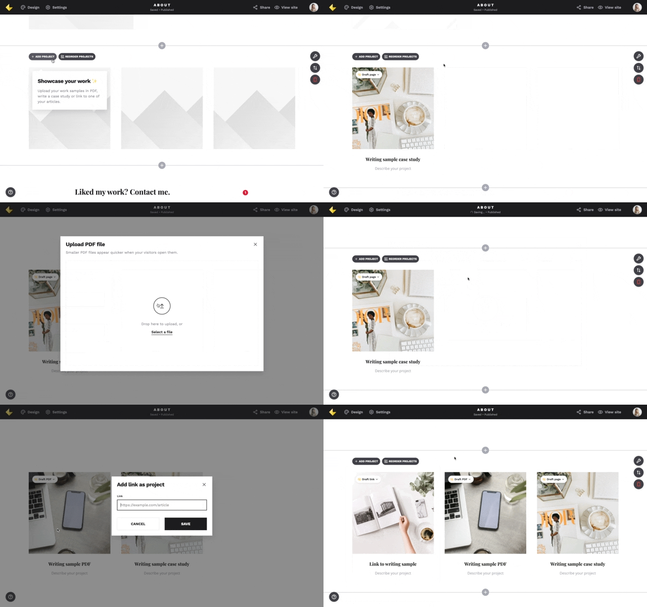
In Copyfolio, you can add 3 types of projects: case study pages, PDF files, or external links. Whichever you choose, we'll add a thumbnail image for you. When someone clicks on it, the project will open, in the case of PDFs and external links, in a new tab.
Do all the thumbnails seem intimidating? No worries, you can create stunning ones easily with Copyfolio's thumbnail designer, even if you only have screenshots:
4. Set a custom portfolio URL
To put the cherry on top of a professional creative writing portfolio website, you should set a custom URL for it.
If you're not a freelancer, you can simply customize the ending of your URL. In that case, it's going to look something like this: https://copyfol.io/v/dorka —that's the link to our writer's own site, actually.
If you have bigger plans for personal branding, expanding your career, or going freelance, it's best you get a proper domain. You can buy one right in Copyfolio that'll be automatically connected to your site. Or if you've bought one already somewhere else, you can easily connect that too.
+1: Customize your extra settings: SEO, favicon, and more
This 5th step is not essential —that's why we named it a +1. But these little things can add a lot to the overall feel and performance of your portfolio. So if you have the time, we recommend you to go through them and customize each to your brand.
Extra things you could do are:
- Optimizing your SEO settings. You can write custom meta titles and descriptions for each page + upload a preview image that appears when the page is shared online.
- Set a custom favicon. It's the browser icon that appears next to the name of your page and it helps people to recognize your site amongst all the tabs they have open.
- Write a blog. All it takes is adding a blog section and clicking the "Add new blog post button" and your blog is ready to go. It's amazing to showcase your writing skills and share your musings with the world.
- Discover your personal brand. Chat with Copyfolio's built-in branding coach: no office hours for Brandi, you can reach her anytime. Yes, even at 3am. Answer a few questions and explore your brand personality, tone of voice, and USP.
- Fine-tune your design. In Copyfolio, you can switch up the look of your site in one click, using global palettes and presets. Play around with the colors and fonts to see which one matches your brand the most.
Create your creative writing portfolio with Copyfolio!
Sounds pretty easy, right? And even if you have questions along the way, the blog and the in-app prompts and guiding questions will be there to give a helping hand. The Copyfolio Team is also always just an email away.
Give it a try, create your creative writing portfolio for free with Copyfolio today!


