29 Copywriting Portfolio Examples & How to Build Yours
In the past 6 years, we’ve seen thousands of copywriting portfolios (no, really) and talked to hundreds of copywriters. That taught us how to spot outstanding portfolios that’ll get you hired, so we collected 29 of them to help you get inspired when you build yours.
You decided: you’re going to update your copywriter portfolio finally. More than that, you’re going to create one so amazing that clients just won’t be able to resist. You even selected some of your favorite projects to add in there. Awesome! There’s just one little problem left… What is it supposed to look like again?
In this post, we’ll show you 29 real copywriting portfolio examples to give you a good idea of what they usually look like. Through these examples, you will learn what makes a copywriter portfolio great, and in the end, we’ll show you how to build one using a copywriting portfolio builder tool.
Use the table of contents on the side to skip ahead to the portfolio guide if you’d like.
Prefer a video format? Check 7 new examples below 👇
Copywriting portfolio examples
Even if you know what you should include in your portfolio, it’s helpful to see how other people have done it. That’s why we’re bringing you 29 copywriting portfolio examples today that we hand-selected from hundreds that we looked through. You can get some inspiration for yours and also learn from them.
Examples of a good copywriter portfolio home page
1. Susanna T.

We are absolutely obsessed with the visuals on Susanna's portfolio homepage. To keep her branding consistent, she's used the same purple tone all throughout: as the background of her profile picture and custom retro visuals, and as the tint of her project thumbnails.
Aside from the great first impression that the strong branding gives Susanna, the homepage itself is also amazingly structured:
- The tagline outlines her profession and areas of expertise at first glance
- She deepens her authority with a straightforward about me section
- There's a creative approach part that helps highlight her unique selling point and differentiate her from competitors
- The homepage highlights both general top projects and ones based on copywriting formats
- Not pictured, but there's also a logo wall, a resume, and a call-to-action section
Pairing a memorable brand with a great structure and impressive copywriting samples is an amazing way to stand out and land the top copywriting jobs.
In case you want to create something similar, Susanna created her portfolio website with Copyfolio's Premier template.

2. K.J. Brett

Kim's copywriting portfolio is the perfect proof that you can have an impressive site even with just a few images. Instead of using pictures, she makes a bold impression with a colorful background, which also helps you focus on the text written there.
She starts out with a crystal clear tagline explaining what she does (copywriting, content creation, and storytelling) and mentioning where she's based (in the UK). She follows that with her top 3 projects —a straightforward and powerful approach.
Her copywriting project thumbnails are all harmonized, matching the background as well, adding to the put-together vibe of the whole site.
And if the case studies didn't convince you yet, she added testimonials from previous colleagues, as well as logos of even more companies she's worked for.
Since she opted for no separate about me page, she added a short about me section to her homepage instead, perfectly encapsulating her personality. Also lacking a separate contact page, she added her email address to the bottom of her homepage as her primary contact information.
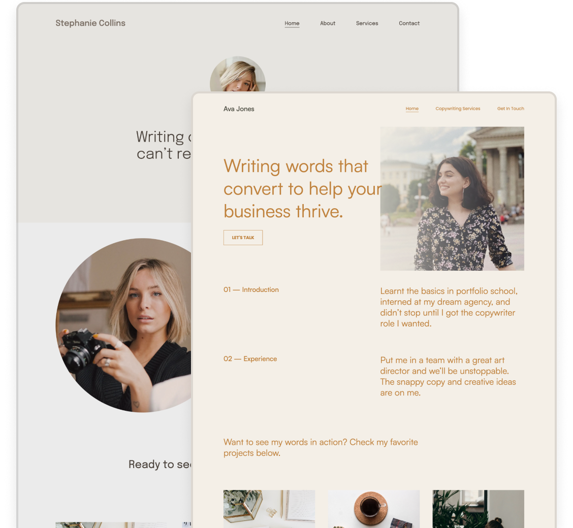
3. Kelsey O’Halloran
The main page of Kelsey’s copywriter website is a good example of what a copywriting portfolio home page should look like. It’s not only beautiful and coherent in style, but also has all the home page must-haves you should also strive to have on yours.

Starts with a picture and a short description. At first glance, you already get to know her a little bit and find out exactly what you can expect. In her case: a copywriting studio for small and mighty brands, with messaging made human.
Shows logos of previous clients. Similarly to Alyssa’s example, seeing brands a copywriter has worked with can make a big impact when a potential client judges credibility. So adding them to your homepage is always a great idea.
Compelling conversion copywriting. If you do it for your clients, why wouldn’t you do it for yourself? Show your copywriting skills by making your services irresistible for visitors —just like Kelsey did here.

Displays testimonials. Social proof is a powerful tool that shows people they can trust your skills and expertise. Thus if it fits into the design, it definitely has a place on your home page. What would be better proof that you write copy like no other?
Features her top projects. With a call-to-action button linking to her portfolio, she features six of her top projects right on the home page. You can see a thumbnail with screenshots for each with the title and category of the project.

Lists her top services. The tagline at the top gave you a clue about what Kelsey does, but here you can really hone in on her areas of expertise. A quick browse and you’ll know if she has what you’re looking for.
Added a short bio. You found out at the top, what kind of work she does, but what about the person behind? Further down the page, you can find her single-sentence bio with another professional photo and a link to her about page.
Makes it easy to get in touch.
4. Alyssa Birchfield

Alyssa’s copywriting portfolio homepage checks all the important boxes. It has:
- A clear tagline stating her profession: we find out right away that she’s a copywriter and content strategist.
- A photo of herself that’s amazing for building rapport. It also shows her professionalism through the quality of the photograph.
- Her best copywriting samples upfront. You can browse her aesthetic portfolio grid with a variety of writing samples: blog posts, social media and email copywriting, websites, and more.
- Logos of her previous clients, underlining her credibility. If all these companies trusted her with their copywriting, she must be pretty great, right?
- An about me section —titled “Meet the Writer” in this case. You might notice that Alyssa doesn’t have a dedicated about page, so introducing herself on the homepage of her portfolio is essential.
- Her CV at a glance, typed out, which makes it much faster and completely hassle-free for potential clients to check Alyssa’s background.
- A CTA (call to action) at the end, prompting visitors to send her an email. It might seem like a small addition, but sometimes a little nudge is all people need.
All these are presented with a simple layout, ample white space, and professional-looking, matching but not identical photos, giving you the image of a high-end, qualified copywriter.
5. Zoe Gekas

When you target luxury brands, your personal brand, and with that, your portfolio website needs to reflect that. If you thought a copywriting portfolio example couldn’t be luxurious, we’re sure Zoe’s page has just changed your mind.
The devil’s in the details, which is true here too: it’s the combination of the colors (deep chocolate brown with cream accents), the elegant serif heading fonts, and the beautiful arched crop of her profile picture that establishes the high-end vibe.
But having a spot-on tone and design is never enough for landing clients: Zoe underlines her credibility by highlighting her multilingual background, showcasing three impressive projects (with more available on her portfolio page), and listing her marketable skills.
And of course, a good copywriter would never forget to add a CTA: hers at the end of the page leads to her contact page, so anyone interested in working with her can reach out easily.
6. Elsa Fernandes

We usually try to only include English portfolio examples, but Elsa’s portfolio homepage was so good, we couldn’t leave it out. Why?
The biggest reason is the layout. It looks clean and professional while highlighting the most important pieces of info and leading your eyes along the page. Your eyes are first drawn to her logo, her friendly and high-quality picture, and her main tagline.
The latter (especially with the three lines under the hero section) already tell you what you need to know:
- Elsa’s a strategic copywriter
- Her target audience is B2B companies
- Her copywriting is not boring (“doesn’t sound like an instruction manual”) but emotional (in the best way)
This right here is her USP. After her logo wall (extra credibility-brownie points for that as well), she even dedicated a whole section to elaborate on that and explain why strategy and emotion should go hand-in-hand. She has a crystal clear message and she communicates it beautifully.
What could be better proof of her copywriting skills than writing a building up a page like that?
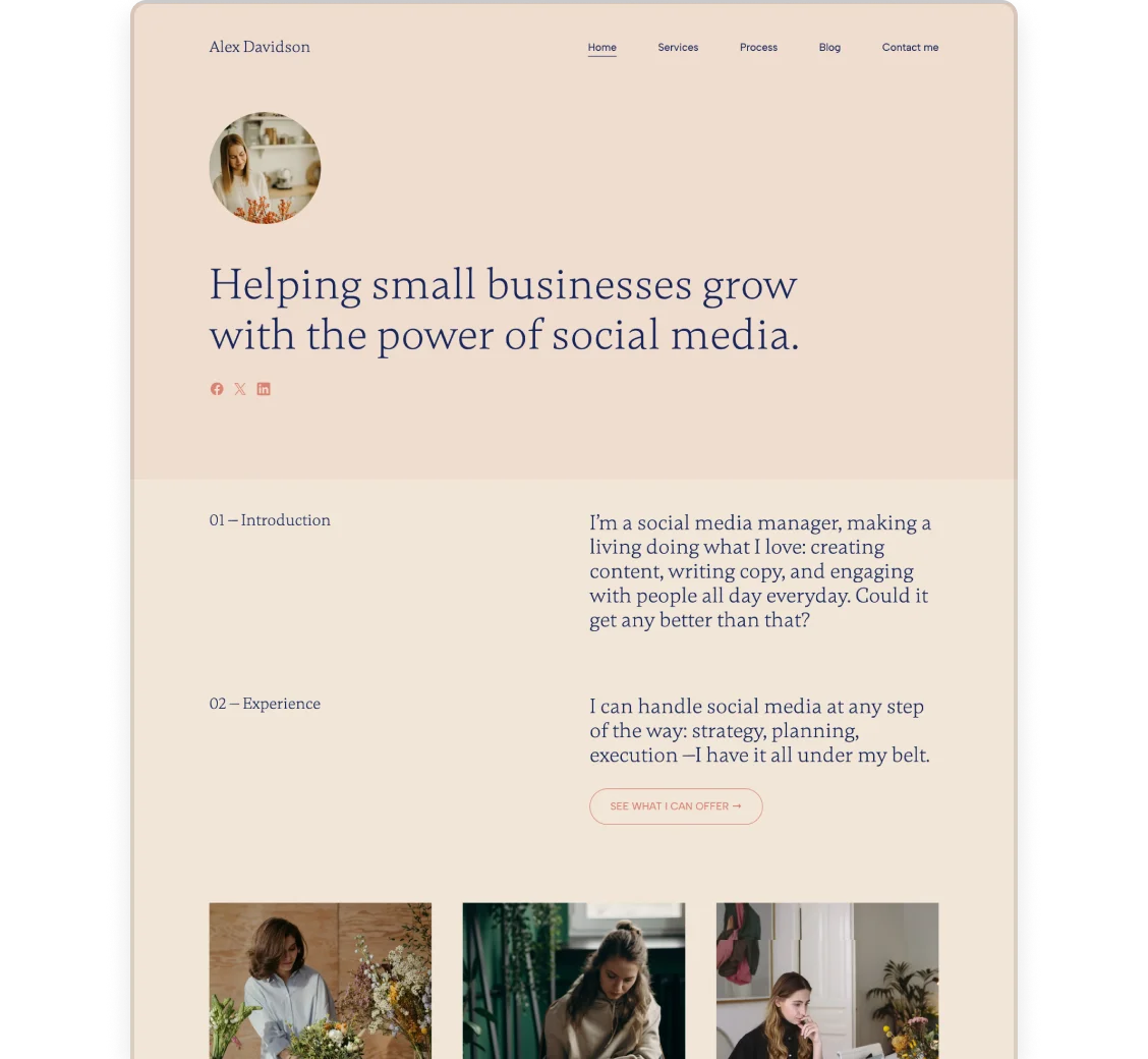
7. Alaina Thomas

Alaina created her copywriting portfolio using Copyfolio's "Journal" template.
Alaina Thomas starts out her copywriting and marketing portfolio homepage with a strong headline saying: “I provide heartfelt copywriting & community-building social media marketing.”
Throughout her homepage (and the rest of the portfolio website), she uses abstract dividers between sections, the pastel grey and brown colors matching her style. She uses them consistently in other graphics as well, establishing her personal brand.
Underneath her tagline, Alaina lists her three most popular services: social media copy, blog copy, and email copywriting. She has a complete Services page that you can see in the top menu, so you know this is just a teaser, and you can head over there to learn more.
Alaina took the usual about me section to the next level. While she still has text on one side and a photo of herself on the other, she used a background and a unique design for the text part.
Since this is not something you could do with most website builders, she created the design elsewhere and added it in as an image.
With the right alt-text, people with disability and search engines will still be able to read it, even if the text is added as an image
When it came to showcasing her projects, she divided her work into two categories: content marketing and social media marketing. Using photos that match the color scheme of the rest of the homepage, she created a visually cohesive and appealing site.
And let’s not forget the CTA she ended the page with. What could be more powerful than the line “let’s write your story together”? Followed by a “send a message button”, clear and straightforward, this closing section couldn’t be any better.
8. Sara Henry

Want an example with just enough (but not too much) content on the portfolio homepage? Then take a look at Sara’s site.
Following her customary photo and tagline combo, all she’s added are:
- An about me section so you can get to know her a little better
- Four of her top projects so you can see her copywriting skills in action
- And a call to action, prompting you to get in touch
Clients and hiring managers are busy, so sometimes the less is more approach can be rewarding. Sara’s portfolio homepage still gives you enough information to decide if she’s a good fit for your job —but it’s short enough that it’s not overwhelming.
9. Savannah Fonseca

Savannah used one of Copyfolio's legacy templates, Agenda, to create her copywriting portfolio
When you look at this homepage, three things will be clear right away: her name is Savannah, she’s a copywriter, and she’s working freelance. And this information is also accompanied by a lovely picture of her, which makes for a more personal connection immediately. That’s exactly what you want a first impression to be like.
Reading on you’ll find out that she has over 15 years of experience (impressive!) with a special interest in lifestyle and kids' content. Is she a suitable copywriter for you? She might have already answered that question.
And if that piqued your interest, you can jump right into her copywriting samples. Savannah presents them in categories such as mailers, blog posts, and social media —and she created thumbnails completed with little illustrations for each of them.
This display of projects is not only great for giving a quick overview of the types of projects Savannah worked on, but also builds her personal brand. Professional, but cute and friendly. Exactly what you’d expect from a writer in the lifestyle and kids space.

Following the projects, Savannah also displays testimonials from previous clients, underlining her credibility. And if that wasn’t enough, it’s not pictured here, but she also shows logos of companies she worked for. A great way to illustrate the years of experience she’s talking about.
10. Carly Zumar

Carly Zumar is a copywriter and social media specialist who created a gorgeous portfolio homepage (and website in general) using Copyfolio and the "Letterpress" template.
Giving her page a crisp white background and adding black text made sure all her images would match the site itself. She also coordinated the colors of her images, on her homepage and in her case studies as well ensuring a cohesive and stylish design.
Are you also a copywriter working lots on social media projects? Check some social media portfolio examples too for some extra inspo.
11. Andrea Nazarian

Andrea has one of those portfolio website homepages that doesn’t actually have the portfolio on the front page. And that’s okay. You still instantly find out that she’s a copywriter, build rapport by looking at her photo, and get plenty of credibility signals that’ll make you want to explore the rest of her site. You’ll quickly find out that she:
- is a multilingual copywriter
- got a Master’s in communication from Northwestern
- has worked with global brands and agencies
- is currently freelancing as a copywriter & creative strategist
Also, have you noticed how the only image on the page is her profile photo at the top? Yet the page doesn’t feel either overwhelming or too text-heavy. That’s for two reasons:
- The font color is not the usual boring black, but a vibrant, marker-like purple. Just that alone makes the page feel more visually interesting
- There’s also a good variety of sections she uses on the page, all with proper spacing. That switches it up with every scroll, making it all easier on the eyes
12. Emma Dodds, NYC-based copywriter

Another great home page example would be the site of Emma Dodds, an NYC-based copywriter. Emma...
- Established a strong visual brand identity with the black and white color palette, profile image, and photo at the bottom of the site
- Used a clear CTA to prompt people to get in touch with her for future projects
- Displayed her projects prominently on her homepage, giving viewers a great variety to browse through and
- Featured her contact information in the site's footer, making it even easier to contact her.
13. Kathryn from CopyKat

The home page of CopyKat Creative is visually appealing, consistent in style, and brief. The first two paragraphs of the copy are already entertaining to read, leaving you excited to find out more. It’s an excellent copywriting example in itself.
And find out more you do, as right underneath there’s a short about section with a second picture of Kat next to it. Too lazy to read much? You can also just browse the attached word cloud instead.
…or check out the logos of brands she’s previously worked with, with some well-known names like Nestle or Tesco sprinkled in there. And if you’re as swept away as we are at this point, you can go ahead and click the funky “View my portfolio” button to see the pieces she’s created for them.
Apart from the vital contact information at the bottom of the page, that’s all CopyKat has on her homepage. And that’s alright as it fills the purpose: showcases her brilliant copywriting skills and unique tone of voice, establishes her authority, and leads you to the next step she wants you to take, which is checking out her portfolio.

14. Cassidy Horton

When it comes to freelance writer websites and portfolios, some checkboxes have to be ticked, if you want to make sure your page converts. Cassidy Horton’s website checks all of these boxes.
She starts with a tagline that says what she does and for whom. In this case, Cassidy is an expert copywriter for personal finance brands. To really hone in on that and make sure business owners know they’re in the right place, she added another section focusing on that.
There she lists the target audience groups her potential future clients should have in order for them to be a good fit. The list includes groups like women, people of color, underserved communities, and more.
Being able to niche down so specifically hints at Cassidy being a very popular and busy copywriter. One who doesn’t have to take any job that comes her way but can pick and choose projects that fit her skills and values.
And it’s not only good for her but for her clients as well. Because they know they’ll work with someone who truly cares about them and their business, and who has ample experience writing for their niche.
She then goes on to the actual sales copy: setting the scene, writing about the problems of her target audience, and offering her services as the solution. Although she has a separate page for her portfolio pieces, just this landing page is a great conversion copywriting sample in itself.
Adding an about section with a photo of herself, and a testimonial from a previous client (also including a nice picture and a big brand name) strengthens both her credibility and her rapport with the visitors, so they’re great additions.
Lastly, if you’ve already confirmed that you’re the type of business (a personal finance brand) working for the type of audience that she specializes in, Cassidy also hands you a list of services she does to make sure you’re the perfect pair for collaboration.
And if you decide you are, you can just click the button underneath and book a free discovery call with her right away.
15. Xon Baker

Colorful portfolios are fun, but what if a copywriter prefers a more laid-back, newspaper-style brand identity? That’s what you can see in Xon’s copywriting portfolio example: a light gray background, characteristic fonts (in black), and black-and-white project thumbnails. The end result is simple yet cohesive.
Xon decided to showcase 8 projects + their resume, which is a great number. It’s few enough that you’d have time to check them all, yet enough to show expertise. They each lead to PDFs or Google Drive folders, but presented like this it’s way more digestible than being sent to a single Drive folder with all that inside.
If you’re not a fan of showing yourself off, let your work and results speak for themselves in your copywriting portfolio.
16. Tom Rigby

Tom is a freelance copywriter from the UK, with over 30 years of experience.
On his homepage, you can find a straightforward intro that tells you just that right away, so you’ll know you’re at the right place. Then to build rapport, Tom’s added a photo of himself with an intro—and a convenient button leading to his about page in case you want to learn even more.
You can also find a list of things he works with within copywriting, each of them clickable, taking you to a dedicated page talking about that specific writing service.
You’ll also find many other pages in his navigation: about, services, clients, sectors, portfolio… He has it all. It's worth highlighting his freelance portfolio page above all. He starts it aptly with some witty copy that lets you get a glimpse of his personality and see his copywriting skills right away.

Underneath those few initial paragraphs, you can find his copywriting samples with larger thumbnails, showcased in a grid layout. They’re organized in alphabetical order by the clients’ names, some of which are well-known brands like Volvo, Mercedes-Benz, or the NHS. It’s already easy to browse through, but to make it even more convenient, you can filter the projects by type: advertising, construction, or portfolio.
Once you click on a project, you can see the finished product (with visuals) on a PDF that opens. The only thing we’re missing here is some explanation for the projects. We’d love to read a little more about the background of these campaigns, what problems the copy solved, and just overall how it was created.
17. Gari Cruze

Gari Cruze is a copywriter with a strong agency background and a lot of cool projects under his name. When you land on his site, you can see his featured projects right away, displayed in a grid with eye-catching thumbnails.
As you hover over you can see that Gari worked for brands like Slack, Lyft, and even the US Department of Education. This gives you a good idea of his experiences and expertise, and will probably get you interested enough to click through.
Although this information is not featured right on his home page, Gari also makes it easy for the viewer to find out more about him with an “About” link in the main menu. He even included a fun “17 random things” page. His about page consists of fun and entertaining copy about himself - and also gives easy access to his writer resume and contact information.
What should good “about me” pages look like?
We’ve talked a good amount about the ideal copywriter portfolio home page, let’s now look at what an ideal about me page should look like.
18. Alaina Thomas

We already showed you Alaina's copywriting portfolio homepage above, but her about page also deserves a shoutout. As you can see, the design is gorgeous, following the style of the rest of the site —but it's the content that makes it great.
She starts with a fun and lighthearted introduction. Instead of the typical paragraph writing about herself, she decided to go with an easy-to-read list of fun facts and a second tagline: a coffee-powered content writing enthusiast.
Alaina then dives into the more professional aspect of herself: her copywriter resume. Instead of uploading a PDF, which you'd then have to download, find, and open on your computer, she simply typed it out for us. It gives a great overview of her past work experience, skills, and the software she uses.
She also added a section for references, which, if you want to get, you'll have to reach out and ask.
19. Ashlyn Carter from Ashlyn Writes

A great example of a great copywriting portfolio about page is the one on Ashlyn Carter’s site, Ashlyn Writes.
Right away, it starts with a few lines that accomplish three things at once: show Ashlyn’s copywriting skills, introduce you to her brand (and brand voice), and tell you what she does exactly.
You know that she’s your person if you want to: get noticed, get leads, and get launched. You also get to learn more about her personally and take a sneak peek into her copywriting achievements, such as working with over 100 clients and 8,000 students, and leading million-dollar product launches. Pretty impressive!

Her about page is full of brilliant copy and personal touches, like the video of herself instead of yet another stationary picture, or the Proust questionnaire she filled. But she’s not only nailing masterfully building rapport, she’s great at further underlining her credibility.
Apart from the high-quality design and photography, she’s also added logos of her previous clients and a section about the team she works with. When a copywriter is above the one-woman-business status, you know she must be phenomenal at what she does.
Then she, of course, leads on with a wittily-written CTA (call-to-action) section, before providing even more helpful information to her visitors.
There are some other elements too on this page that we’d recommend - either here on your homepage. She’s included:
- Magazines and other press she’s been featured in
- Testimonials from clients she’s worked for
- Links to her blog, online shop, and YouTube channel
20. Colleen Welsch from Glossy Type

Like most good copywriter pages, this one starts out with some convincing copy too. First, Colleen has a bite-sized box with the most important info about her. You get to know her name, profession, and mission: helping beauty brands grow their business through awesome content.
With that, she also outlines her core target audience and helps people decide if she’s the right copywriter or content creator for them. Do you lead a beauty brand? Great, keep scrolling. Is your business something far far away from that? Maybe it’s best to look elsewhere.
Then she goes into her origin story for those that want to learn more. Here you not only get to see the person behind this business but also read about what makes for credible. Like her English degree, successful blog, and the list of her relevant work experiences. In the last sentence, she even drops some big names she’s worked with, like P&G or Milani.
And of course, it couldn’t be an about page we recommend without a call to action in the end. With a vibrant section she prompts people to tell her about themselves, leading them to a straightforward “Contact us” button.
If you have a lot of text to showcase, use images, line breaks, and white space to break it up. It won't feel as overwhelming and people will be more likely to read what you wrote.
21. Sly Samudre

Sly’s copywriting portfolio has a relatively short about me page but it has all the info you need to potentially hire him.
He starts with a sort of vision statement saying he’d “bring your brand to life with compelling copy that gets to the heart of your vision”. Notice how, on paper, this page should be about him, yet he makes it about you? Or rather, his potential client reading it.
That’s how about pages on portfolios should be —or they should at least include elements of it. Because it’s just another opportunity to convince hiring managers and clients that you’re the perfect candidate for them.
After specifying the types of materials he writes, he’s featured logos of previous clients in a very aesthetic way.
With Copyfolio’s unified color logo wall section, the logos are turned monochrome, matching the color scheme of his portfolio website. The result? A professional presentation.
Following the idea of writing to your audience instead of writing about yourself, he closes with a list of services he provides. Introducing them with a call to action, “Let’s shine the light on your big idea” and following up with a “Get in touch” button, he lays a strong foundation for conversions.
22. Elysse Bell

The focal point of Elysse’s about page, as you can see, is her copywriting resume. After a very short introduction consisting of 3 bullet points, she dives right in.
Instead of creating a PDF resume and embedding it, Elysse used Copyfolio’s CV section to present it in a way that matches the rest of her site. It has all the important areas:
- Work experience
- Education
- Skills
- Awards and achievements
- Courses and certifications
- Software and platforms
…and the professions of people she’s worked in a team with.
It might not be the most extensive about page in the history of portfolio websites but it gives you a good idea of Elysse’s experience and areas of expertise. And if you want to know more, you can always just shoot her an email.
Examples of the actual portfolio pages
23. Grace Nighswonger

Technically it’s also Grace’s homepage, but since there’s literally nothing else on here just the portfolio, we thought it’d qualify for this category. Grace kept her copywriting portfolio simple: a clear tagline highlighting her USP at the top (telling complex stories and crafting meaningful conversations in your voice, for your business), then six different projects.
You’ll see the project’s name on the thumbnail (made with Copyfolio’s thumbnail designer), a more complete title and a short description underneath. One thumbnail opens a PDF, while the rest will take you to copywriting case study pages, where you can get more info and see accompanying visuals too.
Grace’s portfolio shows that you don’t need flashy images and vibrant colors to look professional and make a statement. All you need is a good layout and cohesive branding—and of course the writing samples to back you up.
24. The Literary Co

Another wonderful example of a portfolio page is from The Literary Co. They decided to feature one important project in a video form, followed by a super convincing testimonial, and then the rest of their work in a list-style layout.
It's all threading the fine line between personal branding and business branding, with how professional it all looks, while it's clearly run by the founder, Kayla.
In their featured projects list, you’ll always see an image on the left, and more info on the right, including:
- The client’s name and industry
- Categories of the work they did
- A button to see the live website (end result)
The beautifully designed portfolio helps with keeping the visitors longer on the page and increasing the overall conversion rate.
The ideal case study in a copywriter portfolio
25. Jeff Seymour

Let’s start with an email copywriting case study from Jeff Seymour.
When you land on the case study page, it’s obvious from the title that it was an email onboarding project —which is one of the best practices we recommend.
Then Jeff outlines to other essential aspects: the brief he got (or you could just write about the project background) and his process of working on the copy. Lastly, he included screenshots of the finished result.
When you click on a picture, it’ll open in a bigger size where you can zoom in and read it from beginning to end. This way you’ll see his writing skills in action getting a good idea of his writing style, and also that it was a real, legit gig.
The only thing we’re missing are some results. For copywriting projects, we recommend you to always follow up with your clients and get some numbers on how your work performed.
For email marketing, ask about open rates and click-through rates. And if it’s for an e-commerce brand, try to find out how much the email generated in sales.
Showcasing numbers for these is always a powerful piece of proof of your copywriting skills and expertise.
26. Sara Frandina

Another great copywriter case study example is the one from Sara Frandina. She has a standard format she uses for each case study, which makes her copywriter portfolio all the more cohesive.
The first part of the case study is split into two columns. On the right, you see the client’s name and the project’s date, followed by screenshots of the finished copy. And on the left, she goes into more detail regarding the background of the project.
She first outlines the challenge she met when taking up the project, then explains the solution she came up with. She also specifically lists what parts she wrote copy for.
And since most of her projects are email campaigns, website copy, and landing pages, where it’s easy to measure, she included the results of her work too. She lists specific numbers of how her copy improved conversion and retention rates, and how much of a sales increase she helped to make.
So again, what makes her case study so good is how she clearly and briefly outlines:
- Who the client was
- The challenge
- The solution
- And the results.
After these essential sections, she smartly includes a testimonial too, followed by a call to action to get started.
27. Anna Rogan

Anna decided to list her projects blog-style in a list, with abstract illustrations next to each.
Under each title you’ll get one or two sentences about the job, the challenge, and the result. Plus an additional link to the content online, so you can check it out if you’d like it.
And while we love how she briefly explains each project, we’re just really missing the visuals. It would be nice to see the finished copy (think screenshots) without having to click through. Not to mention...
You should always expect the content to be taken off the site, no matter how unlikely it seems now. The client could go out of business or just take the piece down for whatever reason. How are you going to showcase your copy then?
So make sure you always take a screenshot to prove it was online and show it in context.
Ready to advance in your copywriting career? Take a look at how to create your first creative director portfolio!
28. Julia Polaniecki

Next up is a strategic copywriting project beautifully laid out on a much longer case study page by Julia Polaniecki.
Since she shares a lot of information, she starts by taking a step back and writing about the client and the project itself.
Only then does she dive into the details, writing about the goals of the campaign and their creative process in working on the copywriting and the website. She does that while showing snippets of their work in the form of screenshots throughout.
Following an important copywriting case study best practice, she ends with a CTA prompting visitors to contact her to “work together on something truly special”. She even added a photo of herself next to it, which is amazing for establishing a more personal connection, showing you the human behind all this brilliant copy—matching her brand character perfectly.
29. Joe Penn

Joe created short, to-the-point case study pages for all of his projects. In this one, for NIVEA, he’s done copywriting for a new ad titled “The Makedown”. He lays out the work in three sections:
- The brief
- The idea
- The result
It’s super quick to understand what the expectations and his scope of work were—and to check the campaign video, which was the end result. It can be played right on the page, without having to leave his copywriting portfolio at all. 10/10 execution.
Even though it’s copywriting, the end result is not always text-based, like in this case. So it’s important to choose a portfolio builder like Copyfolio that makes showcasing any sample format easy.
Tips for creating your own copywriter portfolio
You’ve seen the examples, and now it’s time to learn how to do it yourself. We’ll outline the must-have characteristics of a truly great copywriting portfolio and go over what you should include. Also need a tool that’ll make building fun and easy? We have one you’ll love at the end.
When you think about what makes a copywriting portfolio good, think about the person who’s going to be reviewing yours. It will either be a hiring manager or a potential client of yours, right? Or even a senior copywriter if you're applying for a copywriting internship.
Well, they probably won’t have hours to look through your work, and they’re looking to find out all the essential information about you as quickly as possible.
Your name, short bio, contact information, and even your social links should be easily accessible, so they can quickly get an idea of who you are and where to find you. And in case they want to know more about your background, you should consider attaching or showcasing your resume as well.
To stand out from the dozens of portfolios they might be looking through, yours needs to be visually appealing. If your content is outstanding but the presentation is boring and the page too text-heavy, they won’t bother reading it. They’ll close the tab and skip to the next one.
But how do you make your portfolio appealing and easy on the eyes?
- Use images, white space, and headings to break up the text
- Choose images that are consistent in style and color
- Make sure all images are high-quality
- Keep font sizes and all formatting consistent
And don’t forget: your home page and thumbnails keep the visitors there long enough to keep looking. But it’s the projects themselves that determine whether they want to hire you or not.
So make sure you only include your very best work, and present each case study in a clear, easy-to-understand way. Any copywriting examples that don’t hit your highest standards, should be left out of your portfolio.
Now that you know the guidelines to make the overall portfolio up to snuff, comes the question: “But what should a copywriting portfolio include?” Your absolute best copywriting examples, of course.
You should select projects that you are proud of, ideally covering a range of different formats. They could be TV commercials, radio spots, digital ads, landing pages, email marketing copies, print advertisements… The list is endless.
You don’t have to include everything, but it’s nice to show that you have a versatile copywriting skillset. If you had the chance to work with some big brands throughout your writing career, make sure to display their logos as well.
When writing about each project, think about them as very brief case studies. Make sure you clearly and briefly explain:
- the background of the project and the problem you had to solve,
- your task and problem-solving process,
- the solution or finished result,
- and if possible, the impact it had.
You won’t always be able to measure the impact of your work, but if you can, you always should include it in the project. It’s powerful proof that the copy you write, really does convert.
The ideal copywriting portfolio layout and structure
Another important aspect of a successful copywriting portfolio is its overall layout and structure. It should have:
- A home page,
- About me page,
- Contact page or section,
- Pages detailing each project,
- Services page and
- Testimonials.
The portfolio home page
There are some pages you just have to have on your portfolio site. Probably the most obvious one is the home page. That’s where all your visitors land and get their first impressions. So it’s important to make it not only visually appealing but also easy to navigate. Your home page should have:
- Your basic info. It’s good to add a photo of yourself and a short bio, so the visitors can quickly get an idea of who you are and what you do.
- Social links. They might want to check you out on other platforms if your site got them interested. Why not make it easier and include icons that link to your profiles?
- Your CV. Clients and hiring managers like to see your background, but it wouldn’t be a good idea to clutter up your home or even about me page with that. Instead, include a link to your CV, so they can easily download it, or add it to another page.
- Your top projects. Even if you don’t feature all of your projects on your home page, we recommend you to add at least 3-4 of them. With big, good-looking thumbnails, the visitors won’t be able to resist clicking to find out more.
- Brands you worked with. If you had the chance to work with some big names in your writing career, it’d be a good idea to feature their logos. It shows authority and credibility towards the viewers. After all, if those companies decided to work with you, why shouldn’t they?
A contact page or section
Another non-negotiable is the contact page. You might have wowed a potential client with your work, getting them excited to start working with you. But with no contact information? No matter how much they likes your work, you just lost them right there.
So make sure to include a contact page or section—or at least your email address in the footer of your portfolio. Make it easy to find and reach out, so you never lose a job for a reason like this again.
Your about me page
Once you have these two set up, don’t forget about your about me page either.
Even if you have a photo and short bio on your home page (which you should!), it’s good to have a separate page with more details. You don’t want to clutter up your home page by writing too much about yourself, but that doesn’t mean visitors wouldn’t want to get to know you better.
It’s a perfect place to show your personality and give them a glimpse into who’s behind all of this amazing work they see on the site. And if you’d like to properly feature your CV, your about me page is a perfect way to do so.
Does it feel a little overwhelming? Don’t worry, just because it’s a separate page, it doesn’t need to be long. Even just a single image + text section can do wonders, looking way more professional than a novel-length intro on your homepage would.
Projects and case studies
It’s the home page that helps visitors decide if they want to even stay and see more of your work. But it's the projects or case studies themselves that will determine whether they want to actually work with you.
You have to make sure that each project is
- clearly and briefly outlining the business goals, your process, and approach
- visually appealing with images, videos, or both
- gives credit, where credit is due (to developers, designers, art directors you worked with)
The aim of including the projects in your copywriting portfolio is to show the finished results for each, preferably in context, and also how it solved a business problem. People also like to see your reasoning and thought process behind it.
But keep in mind that they won’t have hours to read through pages and pages of details.
It can be a struggle for experienced copywriters with years of experience to choose which samples to add to their copywriting portfolio. A lot of thought goes into picking the right projects even for a creative director portfolio. If you’re facing this problem, think of the following when selecting your projects:
- The viewers have limited time. This means you should limit the number of projects you include, and only choose the very best ones.
- Do you have a niche or are you a versatile writer? If there are multiple areas you can and like to write in, make sure to include a nice variety of topics to prove that. But if you are specialized in one niche, visitors should be able to see that at first glance too.
- Have any of your projects won awards? In the advertising and copywriting world, awards mean a lot. So if any of your projects won awards, you should include them, clearly displaying the award(s) on the project pages.
- Have you worked with well-known brands? Although you could have super exciting projects with creative solutions working for smaller brands, having big names amongst your clients still carries great weight. So if you do, include those projects on your page.
- Any passion projects that show your personality? Creative directors and HR managers told us during interviews that they like to see some personality in copywriting portfolios. So if you have a project that’s near and dear to your heart, and points you in the direction of your dreams, include it!
After considering these five aspects, you will be able to easily select the projects worthy of being in your copywriting portfolio.
But if you have a very wide array of amazing samples, of different formats and niches, consider creating multiple portfolios. The design and structure can be the same, but tailor it to the specific type or industry. This way you won’t have to leave out any outstanding pieces. And when you’re pitching to a client or applying for a job, just choose and send the more suitable one.
Apart from these, there are some pages that make more sense for freelancers and are just less relevant for in-house copywriters.
One such page that’s good to include is a services page, which is essential for every copywriting business. Copywriters are often either specialized in a certain niche –or the opposite, do other kinds of writings too, such as content or UX writing. The services page is the perfect place for you to detail what kind of jobs you can be booked for, and even specify your pricing if you want to.
It’s worth including testimonials from previous clients as well. Just as you read the reviews of a restaurant or hotel before you go, you’d probably hire someone more confidently if you see positive testimonials of their work.
These are the pages people will want to see if they are considering hiring you for a job, looking for more information on the business-side of your work.
What if you don’t have much copywriting experience?
Don’t worry, you can build a great copywriting portfolio, even if you’re just starting out, aiming to become a copywriter now.
Write spec ads and make up projects
One commonly used practice is writing so-called spec ads, or simply making up projects.
Spec ad is short for speculative advertisement, and it’s used for ads that you wrote, but which have never been published. You can choose an existing campaign and rewrite it, showing your thought process behind it –or just select a brand and product you love and create a fictitious advertisement for them.
When you make up a project for a real or non-existing brand or product, just make sure you outline the following, just as you would in a real case study:
- What does the company do, and what is the product?
- What is the problem your copy has to solve?
- What is the goal of the project?
- What was your thought process when coming up with the solution?
- What is the solution you came up with? Show us the finished product!
- + Is there a way to measure the impact of it? If so, how would you do that?
Clients and HR managers won’t care if that was a real, paying project - they just want to see your copywriting skills through the process and end result.
Offer to work for NGOs, charities, or friends
Another great way to gain experience and projects to fill your empty copywriting portfolio is to offer your services for free or for a symbolic price to organizations you’d like to support.
They often lack the budget to hire professional copywriters and would appreciate the help. Just make sure to clarify that you’d like to use the piece in your portfolio later.
Or if there are no such organizations or charities around, you can even ask your friends to see if any of them could use a little copywriting help for their business or personal projects.
How to present copywriting material visually
Back in the day, a copywriter’s portfolio (or as it was called back then, their book) consisted of a folder with a selection of their best writings. It was simply printed page by page, in black and white. As you can imagine, this form of presentation won’t work today.
Even though the value is still in the writing itself, with more and more beautiful and creative copywriting portfolios popping up, it would be hard to impress anyone with just a pile of text. Not to mention that you need to see the text in context with the accompanying visuals, for it to make sense.
At the same time, one of the biggest struggles writers experience is visualizing their written materials. “I’m not a designer”, they often say. We completely understand the frustration, so let’s see a few ways for solving that problem.
Screenshots
One of the easiest ways to show your copy in a visual way is to simply take a screenshot of the finished, published work. Whether it’s an email, landing page, or Facebook ad –it probably looks better live than just the text alone, without all the surrounding design elements.
Another reason for always taking a screenshot of your work is that the piece might not be accessible online for years to come. Or even available for everyone. It makes more sense for emails and hidden landing pages, but what about articles and main website copy?
It happens sometimes that the client or company decides to modify something later, take it off their site –or they might even go out of business and delete their entire website. So if you were planning on just linking to the piece, so that others can see it live… That’ll become pretty problematic if any of these happens. But if you have a screenshot, you can show the content in all its original glory, even if it's not online anymore.
Highlight it with text formatting
Admittedly, this only works for short pieces of copywriting, but you can highlight it with text formatting. Make the text bigger and bolder, maybe align it to the center, leave enough space around it.
If it stands out enough, you won’t need any fancy design to showcase the writing.
And to take it one step further, you could also pop it into Canva, add a colorful background, and export it as an image. It’ll take only a few minutes, but it can make a big difference.
Just make sure to use colors from your personal brand’s color palette and the same fonts as your website, so the design blends seamlessly into your portfolio.
Mockups
Another great way of presenting your copy visually is by using mockups.
Mockups are images of computers, tablets, phones, or even print materials. You can add your image to make it look like it was displayed there originally.
It helps with imagining what your copy would look like - especially if it is a made-up project that was never actually displayed anywhere. Not to mention it looks so much better than just a regular screenshot.
You can find lots of free mockups online - although you’ll need at least some basic Photoshop skills to embed your image nicely. Just make sure that if you use mockups, you do it well, because dodgy visuals can ruin the overall look.
Don't have any fancy design software? Then just add your screenshots to mockups right within Copyfolio with a single click!
Collaborate with graphic designers
If you’re a copywriter, you’ve likely worked with art directors or graphic designers on projects before. One way to create visuals for your copy is to ask one of them to help you out.
It’s great because you can be pretty sure it’s going to look good. But keep in mind that you’ll be depending on that person. They might charge you or it might take a lot of time… and there’s no guarantee that they will always be readily available, whenever you want to add to it or make a few changes.
Embed or upload videos
Sometimes copywriting is turned into videos (think scripts or ad concepts), which makes your task of visualizing your words much easier. Just upload or embed the video to your portfolio, so it can be played right on the page.
Just make sure to add some context. Somewhere around the video, write about your role in the creation and mention who else you worked on this project with.
Where to host your copywriting portfolio
Now you know how to create a good copywriter portfolio: what pages you need, what kind of projects to include, and how to visualize your work.
But how do you put it to practice and actually build that badass portfolio? Let’s go into more detail on that.
There are multiple ways to approach this and many platforms to host your portfolio, such as:
- Choosing a social media platform. Some platforms like Instagram are heavy on visuals and so more suitable for designers or photographers. You could still consider one like LinkedIn, which gives you more freedom with words and uploading files. However, keep in mind that you cannot customize the page itself, so it will never be truly unique for you.
- Collecting your samples on Google Drive. You can create a Google Drive folder and upload your documents there to share with potential clients and hiring managers. It’s free and easy to upload, but it’s not the easiest for them to sort through. And it doesn’t look very professional either.
- Building a custom website. Building a website from scratch for your portfolio sounds cool, but there’s a downside. You’ll either have to know how to code or be willing to pay hundreds or even thousands of dollars for a developer to do it for you. And then we haven’t even gotten started on creating the design and the visuals for it.
So instead, you could do it...
Using a copywriting portfolio builder tool
Did you know that there’s a portfolio builder tool designed for copywriters?
All you have to do is choose your profession (copywriter) and your goal (build a portfolio), and you'll get a website with customized content. Upload your own images, add your projects, modify the copy a bit —and you're all done.
It's super quick and easy.
If you want to tailor it to your personal brand and elevate your online presence, you can also:
- Create a custom color palette and apply it to your whole site with a single click
- Buy a custom domain that'll automatically get connected to your site, including an SSL certificate
- Set a custom favicon, so your portfolio's browser tab is easily recognizable
- Customize your SEO settings like meta titles and descriptions, so people can find you in search more easily
- Match the tone of voice of the portfolio to your personal brand with the help of Brandi, Copyfolio’s virtual branding coach
How to you create a portfolio website based on these copywriting portfolio examples
Your best bet for easily creating a portfolio is using a portfolio builder tool that was designed for copywriters.
The best option for copywriting portfolios is Copyfolio.
Most website builders and portfolio sites were created with designers or photographers in mind. This means they rely heavily on you already having lots of great visuals, and it can make using them quite troublesome for writers.
But if you choose a platform like Copyfolio, you won’t have to worry about design and visuals. You can focus only on writing and still create a stunning portfolio that’ll look good on any device. Here’s how easy it is:
1. Complete the top of your portfolio homepage. This is what people see first, so make this first impression impeccable. Write a strong headline and upload a convincing picture of yourself if you have one.
2. Add your copywriting case studies. If you're in a pinch, you can upload PDFs or add external links, but for the best-converting portfolio, write briefly about the project and your creative process, then show the finished results and their performance.
3. Choose your project thumbnails and adjust the design. This step is for the look and feel. Add thumbnails that match (the thumbnail designer will make it super easy) and adjust your site's design to match them and your personal brand.
4. Write your about me page or section. It can be a few paragraphs on your homepage, or it can have a dedicated page. Introduce yourself to build a personal connection, but keep it professional.
5. Get your own domain and take care of the technical details. For a truly professional impression, everything needs to be in place. Grab a custom domain for a URL, fill out all pages' meta data, and set a custom favicon.
It's super quick and easy. You’ll be able to build a portfolio in less than an hour and still end up with a site that looks amazing. And converts.
Want to get even more out of your portfolio? You don’t have to stop there then. You can also…
- Figure out your brand personality with Copyfolio's branding assistant, Brandi. Chat with her, answer a few questions, and nail all the details.
- Optimize your SEO settings and help even more people find your portfolio
- Write a blog to showcase your writing skills and share your thoughts
- Build an even more convincing portfolio by adding your resume, about or services page, using convenient page presets
- Keep an eye on your visitor statistics with built-in site insights to see which page or project is the most popular and make changes based on that
- Or connect Google Analytics to drive even deeper into your visitor data
Sign up and create your copywriting portfolio today!