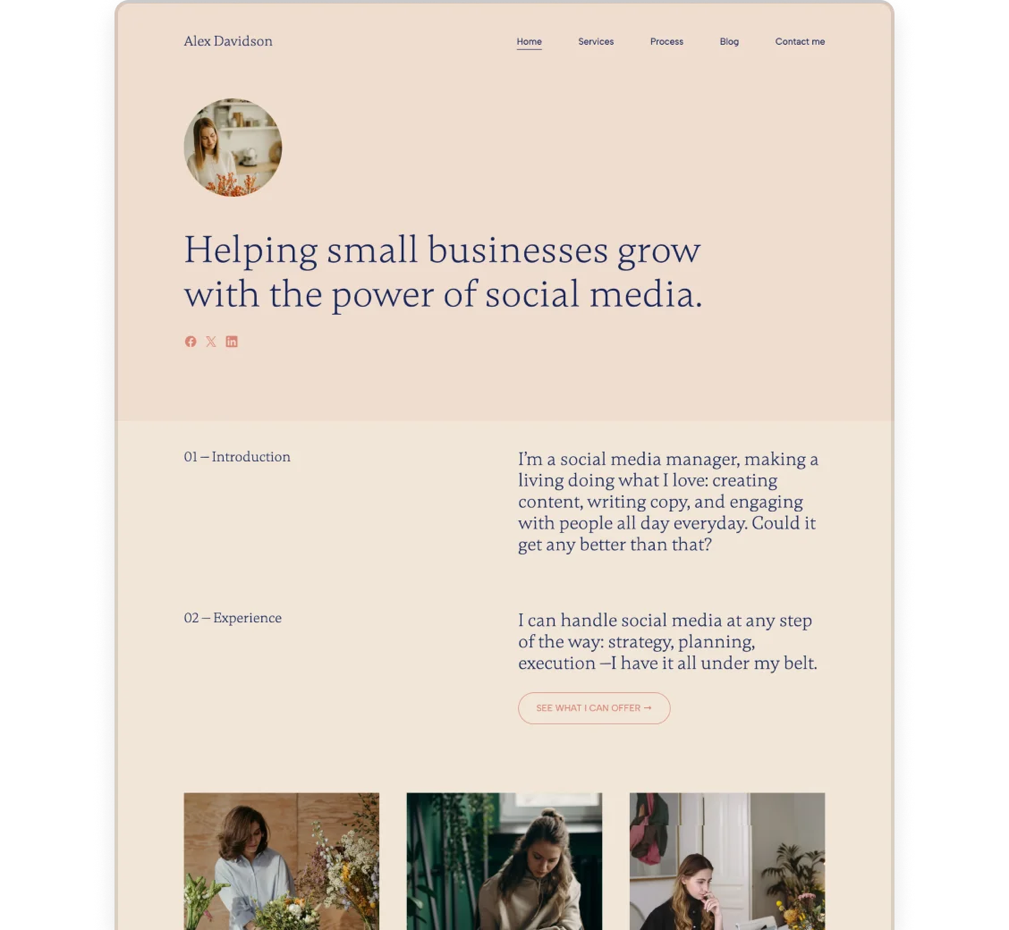
Whether you’re a copywriter, marketer, or social media manager, a portfolio website is a must these days. For maintaining your online presence and personal brand, and landing new jobs. But no matter how impressive your work samples are, bad design choices can easily ruin your online first impression.
We have 5 simple tips to share, to help you make sure that your portfolio has a top-notch, cohesive design.
1. Stick to a color palette
One of the biggest mistakes people make is using way too many colors on their site, making it look like a branding-patchwork disaster. Instead, stick to one color palette and use that all throughout your site. If possible, make sure headings are always the same color, buttons always coordinating, and so on.

If you build your website in Copyfolio, you can apply a color palette to your whole site with one click, you don’t have to go through each element to recolor them if you changed your mind.
2. Use the same type of images
Cohesiveness is also important when it comes to your images. If you use photos here, and illustrations there without any rhyme or reason, it’ll feel like visuals were just an afterthought. Like you don’t take your site seriously and don’t really care how it ends up looking like. So try to stick to one kind and only stray from that where it really makes sense.

3. Choose pictures that go together
Speaking of pictures, try to choose ones that look nice together. For example, if you have a portfolio section with a grid of thumbnails, it’ll look awkward if the images don’t go together. Or rather, it’ll look really good if they follow a similar color scheme.
Another thing to look out for is matching the pictures to your site’s background color. If you have a colorful, orange-toned background let’s say, purple-toned images might look very odd against it.
But if you have images in all kinds of colors, going with a white background for your website is always a safe choice.
4. Use the same 1-2 fonts throughout the site
Similarly to colors, using too many fonts on your website can be visually overwhelming. So for the sake of looking professional, choose one, or a maximum of two fonts that you use throughout your site.
If possible, also use these fonts on other branded materials you have, to make sure your brand identity online is always consistent.
5. Make sure you have enough white space
This last one is something most people don’t even think about, although it usually makes or breaks the design of a portfolio website.

White space just means how much empty space you have around elements. If it’s not enough or too much, the page will just feel… off. But other than that, it can also affect whether some text is easy to read or not —and how your eyes move throughout the page.
To get a good idea of the ideal white space, try to find popular examples for portfolio websites in your niche, and look to them for inspiration. Here are some blog posts compiling some examples like that:
But the easiest way to get it right is by using a website builder that sets the white space for you to an optimal size automatically. A builder like that is Copyfolio, where you’ll never have to adjust margins and paddings or wonder if it looks right like that. Our designers made sure it always does.


