The Best Social Media Portfolio Templates (Free & Responsive)
Working in social media teaches you the value of templates. They give you a solid base to start with that you can customize, keeping everything consistent and saving you tons of time. The same goes for social media portfolio templates. They’re the perfect choice if you want a powerful site to showcase your work without spending hours upon hours working on it.
In this post, we’ll show you how to create your social media portfolio using a template in 5 simple steps. We also brought you some real-life portfolio examples to give you some inspiration before getting started.
And the best part? We’re telling you exactly what template they were made with, so you can easily recreate their looks yourself.
How to create a site using a social media portfolio template
Apart from using a template, having a plan in mind is what makes every process faster and more efficient. In this section we’ll outline a plan for you to show how to create a social media portfolio in 5 easy steps, using a template.
Step 1: Choose your starter portfolio site
The closer the starting point is to your vision, the fewer changes you’ll have to make. So look through the templates you can choose from carefully. Look at the layout the site has: how the homepage looks and what sections it has by default.
Don’t forget to also check what pages the site will come with. Some are set up for about and contact pages, while others might have a page for showcasing services already. If you’re a freelancer, choosing one like that could save you a lot of time.
Lastly, consider the look and feel of the portfolio template. While you can always change up the colors later, selecting one that you already like will make things just that bit faster.
Step 2: Fill out your portfolio homepage
Once you have your hands on your starter site, the first thing to do is take care of your homepage. Since this is where all your visitors land, it’s important to make a good first impression with it. For that, you’ll need convincing copy, great visuals, and clear navigation.
Start by writing a tagline to the top of the homepage that briefly describes who you are and what you do. With that people will know instantly if they’re at the right place: whether you could be who they’re looking for.
We recommend you add a photo of yourself too. As humans, we’re all naturally drawn to faces. So having yours on your page will keep visitors’ attention and help you build a more personal connection.
Whether you add additional sections between that and your projects is a matter of personal preference. You’ll see in the portfolio examples later that both could work really well.

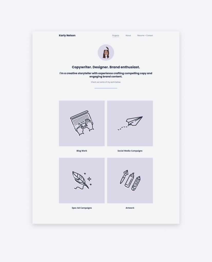
Karly Nelson's social media portfolio homepage, created with Copyfolio's Letterpress template
Step 3: Add your social media projects
The main aim of creating a portfolio is to showcase your work. So it will come as no surprise when we say that adding your projects is a crucial step.
For a social media portfolio, we recommend adding 4-6 projects and creating a separate page to write about each. There you can share more details about:
- the client or company you worked for,
- what the goals and KPIs were,
- what responsibilities you had exactly,
- how you went about executing your tasks,
- what the end results looked like, and
- how the content or campaign performed.
Without these details, it would be hard for any potential client or employer to gauge whether you’d be a good fit for what they’re looking for.
Step 4: Complete your about & contact pages
With these previous steps completed, the most important part of the work is done. But you wouldn’t want to leave your social media portfolio unfinished, right? Then it’s time to take care of the rest of your pages.
If you prefer a one-pager layout and don’t want to fuss with them, you can of course delete them as well. Just make sure to have at least a small about me section and your contact information somewhere on that page.
Otherwise, write about your background and accomplishments on your about page. But don’t make it too long, nobody has time to read a novel there. Instead, highlight what makes you stand out from all the other candidates they might be considering. Your about me page would also be the perfect place for showcasing your social media resume.
Step 5: Get a domain and share your site
This last step is to make your marketing portfolio website truly professional by getting a domain. Having a custom domain won’t just make it easier to type and remember for people, but it’ll also show them that you care to invest in your professional online representation. That you’re in it for the long run and know how to prove that too.
If it’s available, try to get your name as a domain with a .com at the end. If not, you can look at other extensions (e.g. net or org) —or add “social” or “socialmedia” after it too.
Social media portfolio examples made with Copyfolio templates
Since “show, don’t tell” is one of the main principles of portfolios, we’d like to stick with that for this article too. To give you an idea of what you could do with our social media portfolio templates, we’ll show you real-life examples of websites our users made.
There are other templates too, available in Copyfolio. You can also always customize them even more with different colors, sections, and visuals —so this section is here just to give you a general idea.
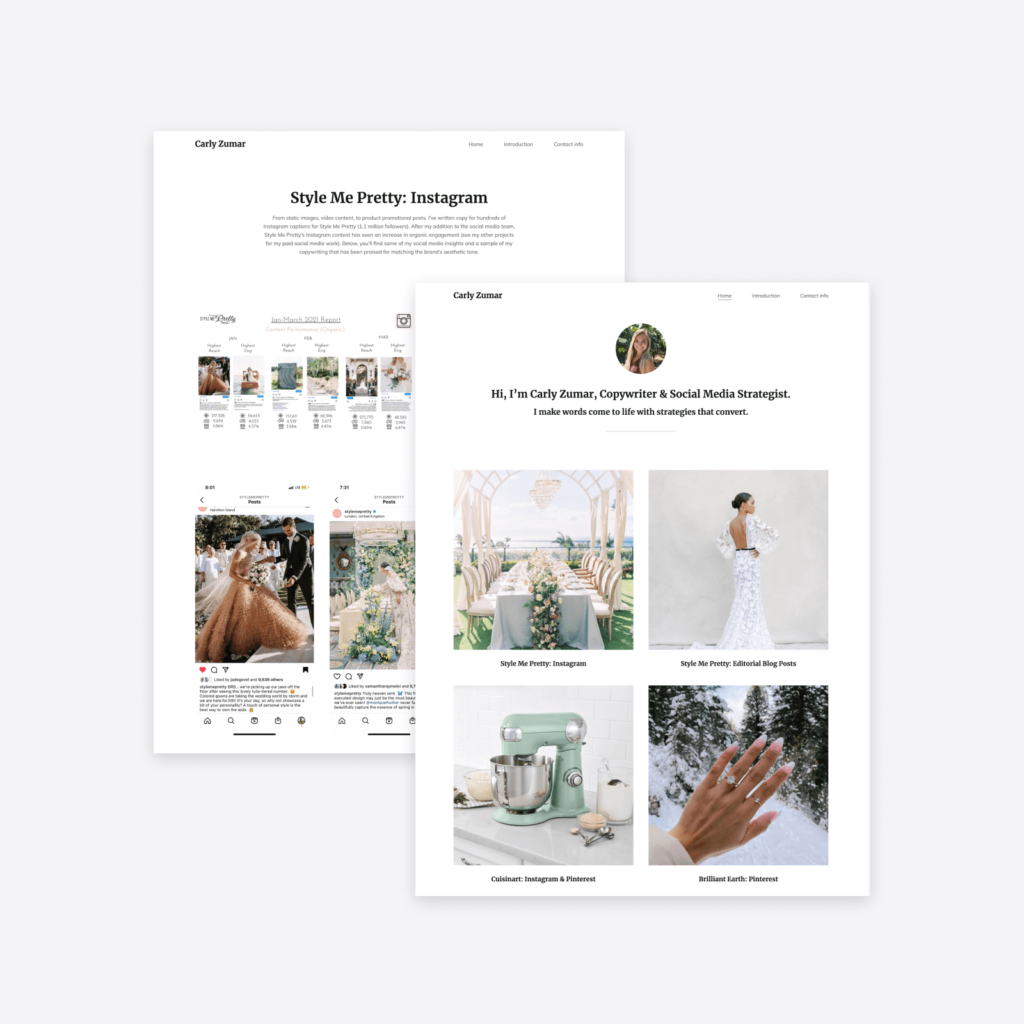
Letterpress social media portfolio template — Carly Zumar
You can recognize the Letterpress template from the circular image at the top of the homepage. People usually upload a profile picture or logo here before writing a strong introductory tagline.
Letterpress comes with a crisp white background and a yellow accent color —which Carly swapped out for a completely black-and-white look. This simple setting lets her thumbnail images truly shine. With no additional sections in-between, your eyes and attention are pulled directly to her projects.
Liked Letterpress? Click here to create a portfolio site with it for free!
Journal template — Valeriia Ivanova
The hero image (that’s what we call the first prominent image of the website) is much bigger on Journal than it was on Letterpress. It’s also rectangular, located on the right side, and adaptive in size. That means that the more you type next to it, the more its height is going to grow.
While social media managers love to use it for their portraits, Christy uploaded a picture of some monstera leaves to set the vibe of her site. This shows perfectly that you can use these images for branding purposes too.
Christy then used the same image as the base of her thumbnail templates. She added white blobs with icons in them to the middle, creating on-brand, easily recognizable images.
Liked this template? Take it for a spin and create a site for free!
Premier template — Erin Hall, Mayhem Advertising
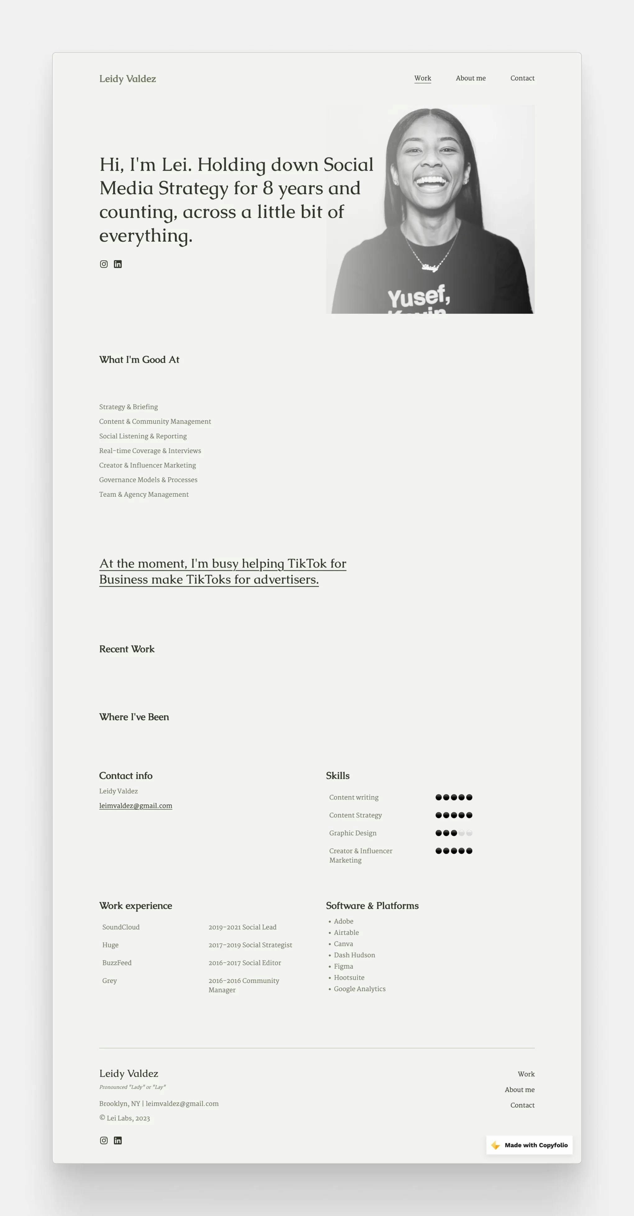
Premier is similar to Journal in having an image on the right side. But here the tagline to its left overflows onto the photo. To make sure it's still readable, we added a fade to the side of the image, so you don't have to worry about it.
So if you have a great photo of yourself, but find the traditional layout of Journal a little boring, Premier will be perfect for you.
Want a similar site? Sign up to Copyfolio and choose the Premier template!
Typewriter template — Fika Bahroeny
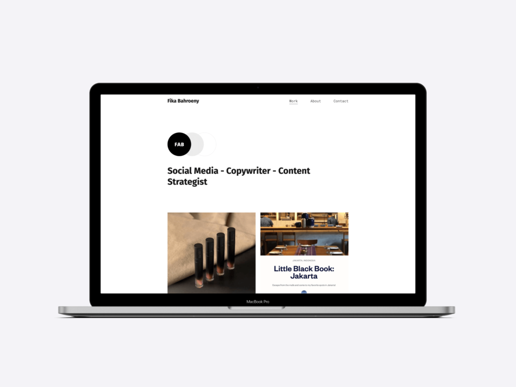
Typewriter has the smallest hero image of them all. If you’re not a fan of uploading profile pictures and prefer a more minimal look, you’ll love this one. It has some decorative circles next to the image, which change color based on the palette you choose.
By default, it comes with a black and white color palette —which our users seem to love. They rarely switch to others for this template.
Some people keep it minimalistic when using Typewriter, both in terms of image colors and sections. Others go for vibrant pictures that pop amongst the black and white and add sections like services and short introductions before diving into their project showcase.
Want to give it a try? Create a site for free and check out the Typewriter template now!
Create a website with a Copyfolio social media portfolio template!
If you were on the hunt for a quick and easy way to create your social media portfolio website, look no further. With Copyfolio’s templates, you’ll be able to set up and finalize your site in just about 30 minutes.
After signing up, you’ll get a starter site with 3 pages: usually a homepage, an about, and a contact page. These will be filled with either example sections or guiding questions, so you can follow and fill them with your own content.
You can always delete or add sections too, adding text, images, services, contact forms, and more super easily.
You’ll find a section for showcasing your projects towards the end of your homepage. Here you can add projects as case study pages, PDF files, or external links. If you go with a case study page, there will be prompts and guiding questions waiting for you to make writing it easier.
Publish your projects, get a custom domain, and your social media portfolio will be ready to go. Sounds exciting?
Click here to take Copyfolio for a spin and create your portfolio website for free!
Looking for more? Don't forget to check out our articles about copywriting portfolio templates and marketing portfolio templates too!


