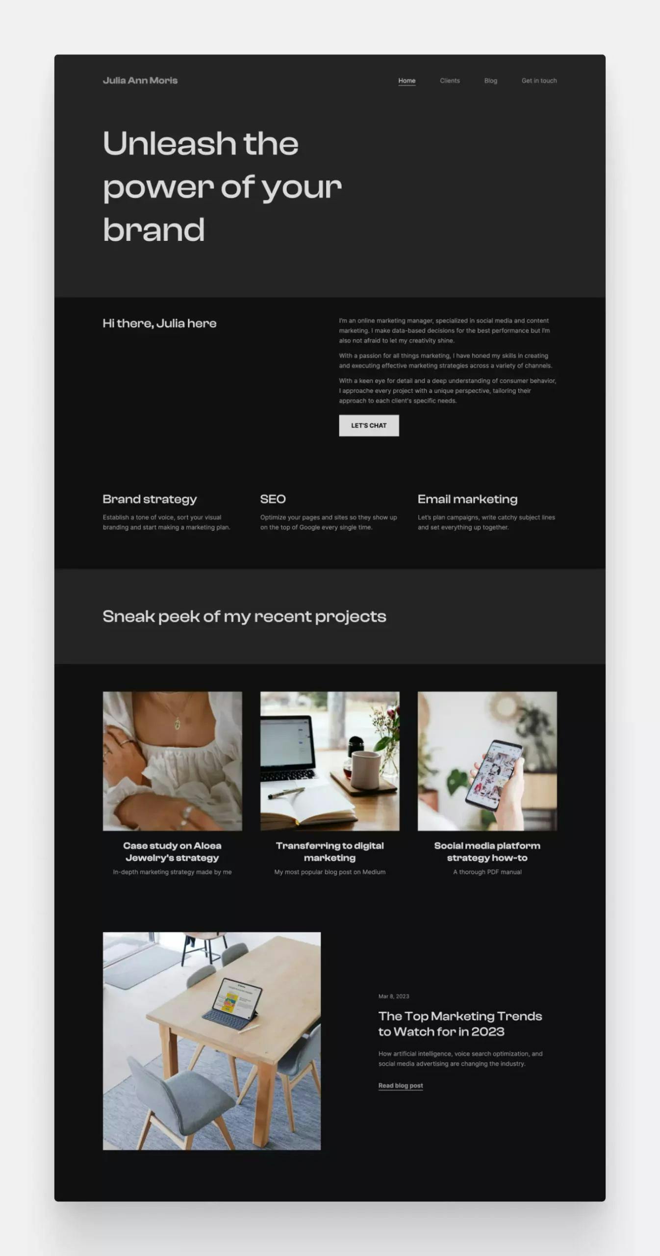
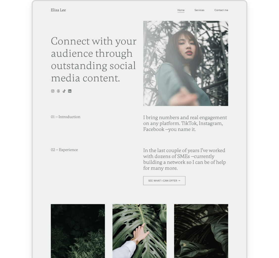
The Best Marketing Portfolio Templates (Free & Responsive)
You want to stand out from all the other marketers, and decide to create a portfolio website to do so. Fantastic idea, but how exactly do you do that? Building a site might seem overwhelming, but in reality, it’s not nearly as complicated and time-consuming. The key to creating a stunning one quickly and easily is using a marketing portfolio template.
In this post, we’ll show you just how easy it is to create your professional portfolio. We’ll go over what makes a good marketing portfolio template, so you know what to look out for. Then with a quick 5-step guide, we’ll show you how to create a site using a template in just about 30 minutes.
Prefer to watch it as a video? We came prepared:
We’ve also collected 14 marketing portfolio examples that marketers created using Copyfolio templates, so you can see how the templates work in action.
What makes a good marketing portfolio template?
Templates are supposed to make your workflow faster and your life easier, and to do that, they need to check some boxes. A good marketing portfolio template should be:
- Simple to set up. Setting up your starter site with a template shouldn’t take more than a few clicks. If you’ve been trying to get started for more than a minute or two, it’s a sign that you should choose a different website builder.
- Easy to master and work with. Templates are meant to save you time. If you’ve been playing around with it for a bit, but still not getting the hang of it, it might not be the one for you.
- Making designing the website faster. It’s not just using the editor itself that should be faster with the right template, but designing the portfolio overall. Not having to manually fiddle with the smallest details and effortlessly creating good-looking pages suggests you chose your template well.
- Creating a responsive site. Showing up properly on phones and tablets is a basic criteria for websites now. If an editor makes you manually adjust everything for different screens, it’s a no-no. Choose one that automatically does that for you.
How to create a site using a marketing portfolio template
Choosing the right portfolio template is only the first step in creating your marketing portfolio. But what comes after? That’s exactly what we’re going to go over in this section, giving you a simple 5-step guide to building your site from scratch.
1. Grab your free template and create your starter site
The first action you’ll have to take is signing up and creating an account with the website builder of your choice. At Copyfolio, it’s completely free and takes just about a minute or so.
It’s going to be during this sign-up process that you can also choose a template you like. The template will determine part of your homepage layout, and the vibe of your starter site. Don’t worry, you can always customize it later if you’d like.
2. Fill out your homepage with the essentials
As it’s going to give people their online first impression of you, your homepage deserves some time and attention. Probably the most important part of it is what people are going to see when they land here: the very top of the page.
Your site’s navigation comes first (that’s inevitable), but you should have your professional tagline right underneath. Think of it as an elevator pitch that sums up who you are and what you do in a way that’ll pique others’ interest.
Don’t forget to add an image here too, to make it visually more appealing. We’re naturally drawn to human faces, so uploading a photo of yourself would be a great idea. Not to mention that it’ll help build rapport and establish your personal brand.

A portfolio website with a profile picture at the top —created using Copyfolio's "Artboard" template
You can have a minimal approach and dive into your projects right after that, or add a few more sections like a mini about me going into more details, your services or areas of expertise highlighted, or a recommendation from a previous boss or client.
3. Add your marketing projects
One of the main goals of having a marketing portfolio is to showcase your previous work, underlining your expertise and achievements. No matter where you are on the marketing career path.
In Copyfolio, it’s really easy to add them as projects, right to your homepage.
You can choose to create a case study page, upload a PDF file, or add an external link. For marketers, we recommend creating a new page for each project, as it’ll give you the space to write down all the important information. But what info should you include exactly?
- Who was the project for? What company or client?
- What type of project was it? E.g. email marketing campaigns, online advertisements, a brand deal with influencers, etc.
- What was the goal of the projects and what were the KPIs?
- What was your responsibility specifically?
- What challenges did you face and how did you overcome them?
- What did the end result look like and how was the performance?
If you’d like to read more about how to showcase marketing projects, going into details about different types, check out our article about marketing portfolios!
3. Write your about and contact pages
Your homepage and projects take the lead, but it’s worth writing the about and contact pages too. Don’t put too much pressure on yourself, it’s better done than perfect —but you never know who will need their extra little nudge to give in and convert.
When it comes to your about page, remember the marketing principles you’d follow for writing a sales or landing page. It should be about them (your website visitors) and what you can do for them. Emphasize your expertise and add a touch of personality to make it relatable, and yourself approachable.
It’s a little different for your contact page. There’s no need for stories and long explanations, you just need to make it easy. As easy as possible for them to get in touch. You can either just write your email and/or phone number, big and bold —or add a contact form instead.
4. Set a custom domain and share your site
The last thing you need to make your portfolio site perfectly professional is a custom URL. The best option is to get your own domain name —here’s how you can get a domain in Copyfolio. It’s the easiest to remember and shows others that you invested the time, effort, and money into your personal brand, therefor you’re someone to be taken seriously.
If you don’t care that much about building a long-lasting personal brand and don’t want to spend the extra $20 for a domain, you can also go with a simple custom URL ending. This means that your site’s link would start with your website builder, and have your custom name at the end. Like this: copyfol.io/v/yourname.
Marketing portfolio templates in action: 14 marketing portfolio examples made with Copyfolio
Starting with a template will save you loads of time, but you can still add all kinds of sections and change up the fonts and colors to truly make it your own. To give you some ideas of how some of Copyfolio’s marketing portfolio templates look “in real life”, we’ll show you a few sites our users built using them.
Our most popular marketing portfolio template: Letterpress
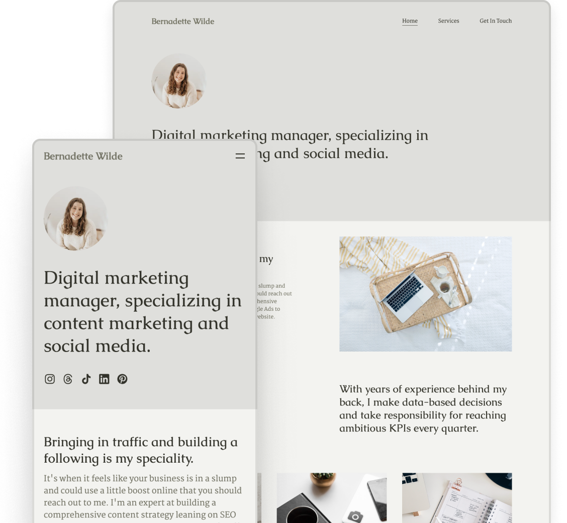
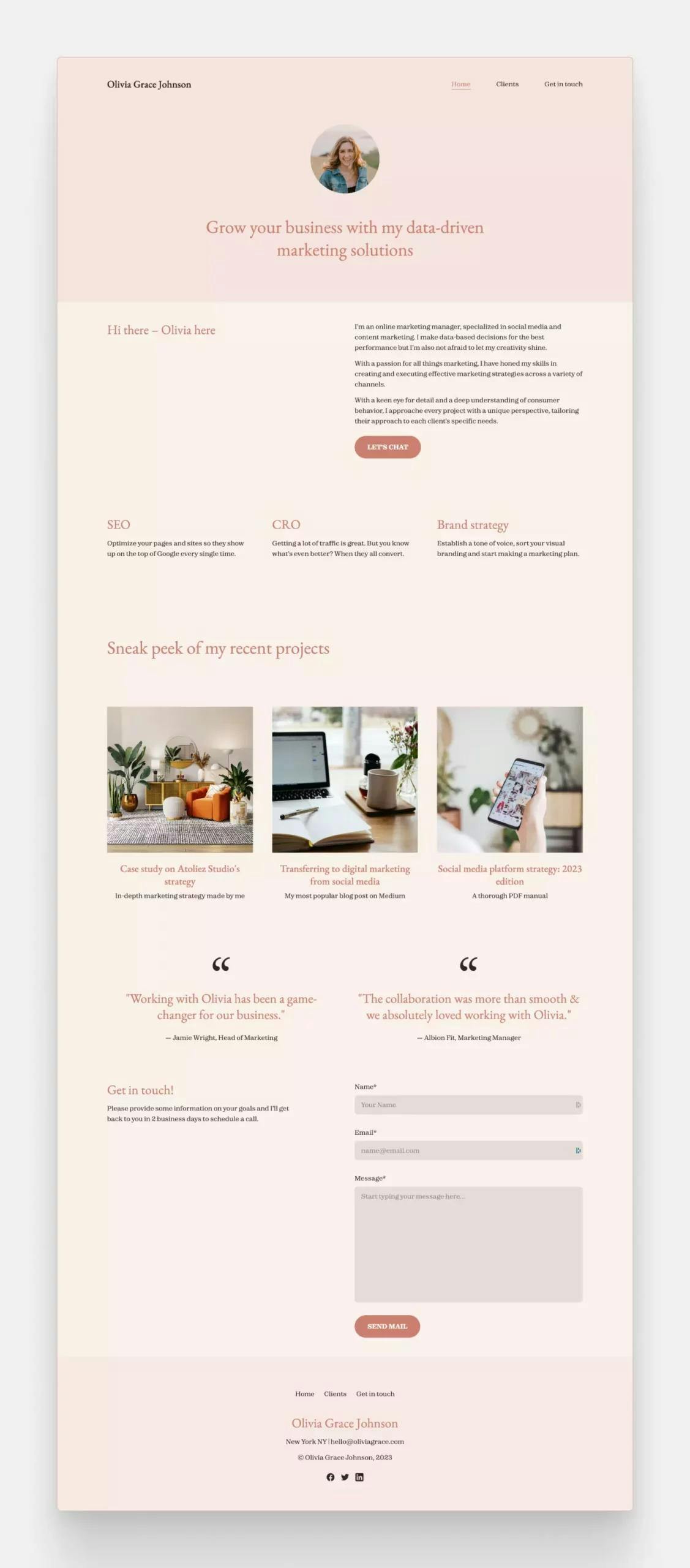
The “Letterpress” template has a circular image at the top of the homepage, which is perfect for adding a smaller profile picture, or even a logo.
The updated Letterpress template with its default pastel coral color palette.
Chuck Lepley
Chuck gave the Letterpress template a darker look by switching to the Basalt color palette. This really makes his images pop, especially as he has lots of colorful visuals amongst his work samples.
Abigail Jones-Walker
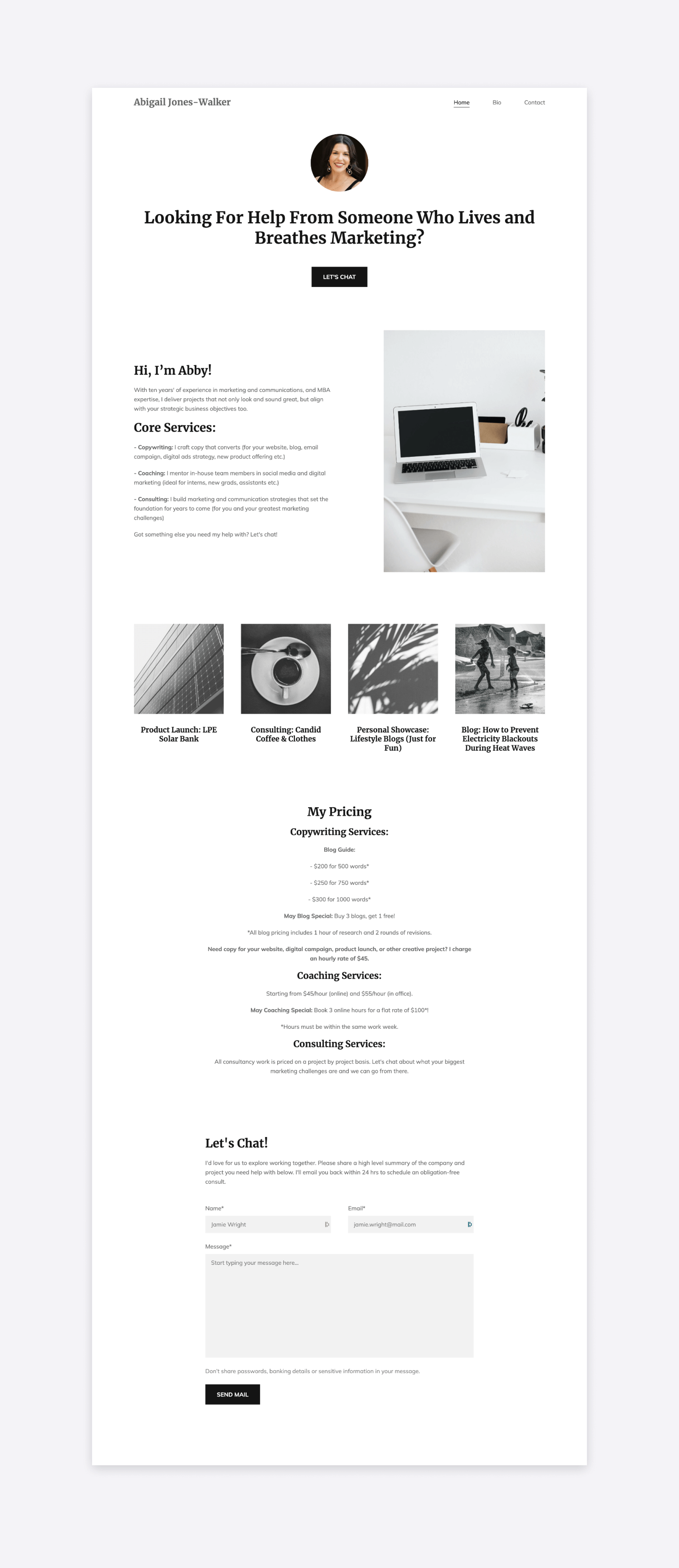
Abigail swapped the original color palette for the black-and-white “Ink” palette and used similar photos for a super cohesive overall look. She added a CTA button below her tagline and wrote about her services alongside her short about me section, before diving into her projects and pricing.
Halle Snavely
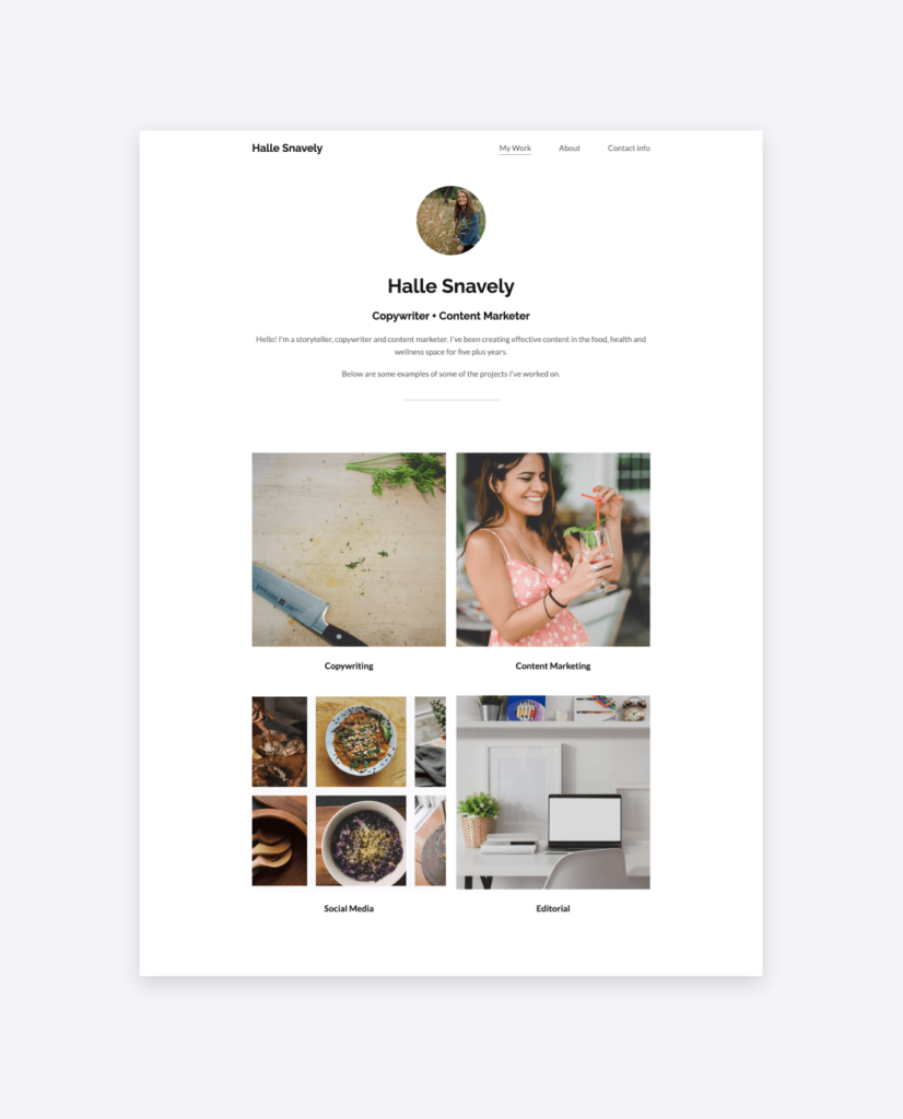
Halle used the same color palette but decided to keep her homepage simple. After a short and to-the-point introduction, she went straight for displaying her work. She did so by dividing them into four categories instead of adding individual projects.
Michelle Bruxer

Michelle’s portfolio is similar to Halle’s in that her homepage only has her tagline and projects. The difference is that she used a different font preset and color palette, and organized her four projects in a row of four smaller thumbnails instead of the two-by-two grid.
Liked Letterpress? Click here to create a portfolio site with it for free!
Our minimalist template: Typewriter
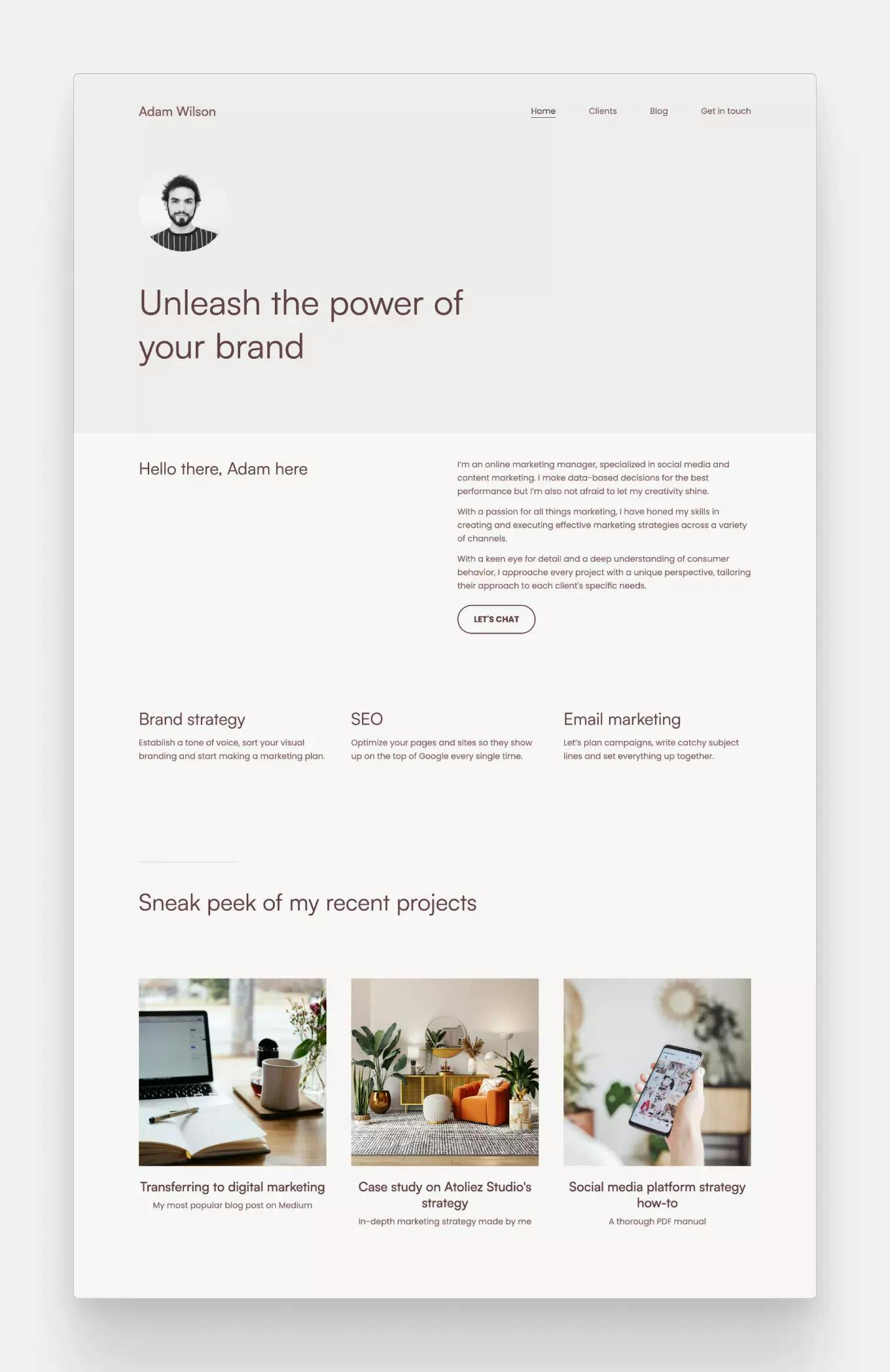
The “Typewriter” template is popular for its clean and minimal look: it comes with the smallest hero image of all the templates, and the black-and-white palette by default.
The updated "Typewriter" template, now featuring a single circular image on the left.
Jaxon Curtis
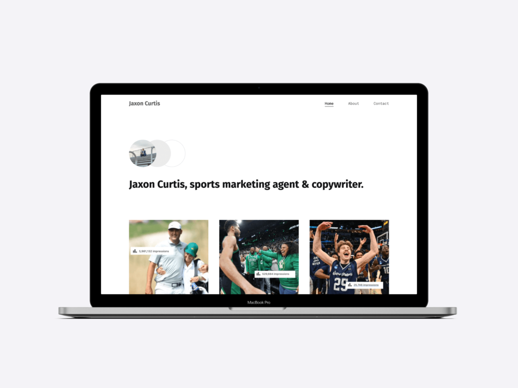
Jaxon went along with the minimal theme by adding a short tagline and his projects only. For the projects, he coordinated all the thumbnails: an image of the people from the project overlaid with a screenshot of the impressions that specific post got.
Julie Tepe
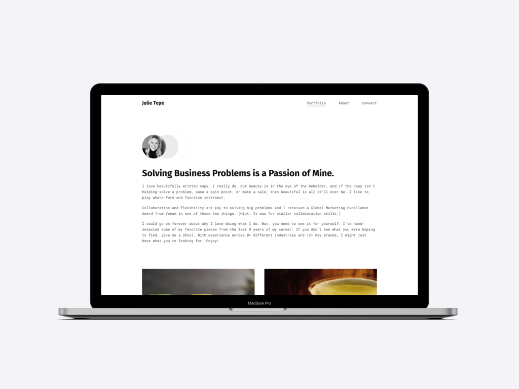
Julie on the other hand went for a more text-heavy homepage. After her tagline she added a section of text about her interests and expertise, and only then does she continue with her projects.
Liked Typewriter? Click here to create a portfolio site with it for free!
Great for branding: Journal
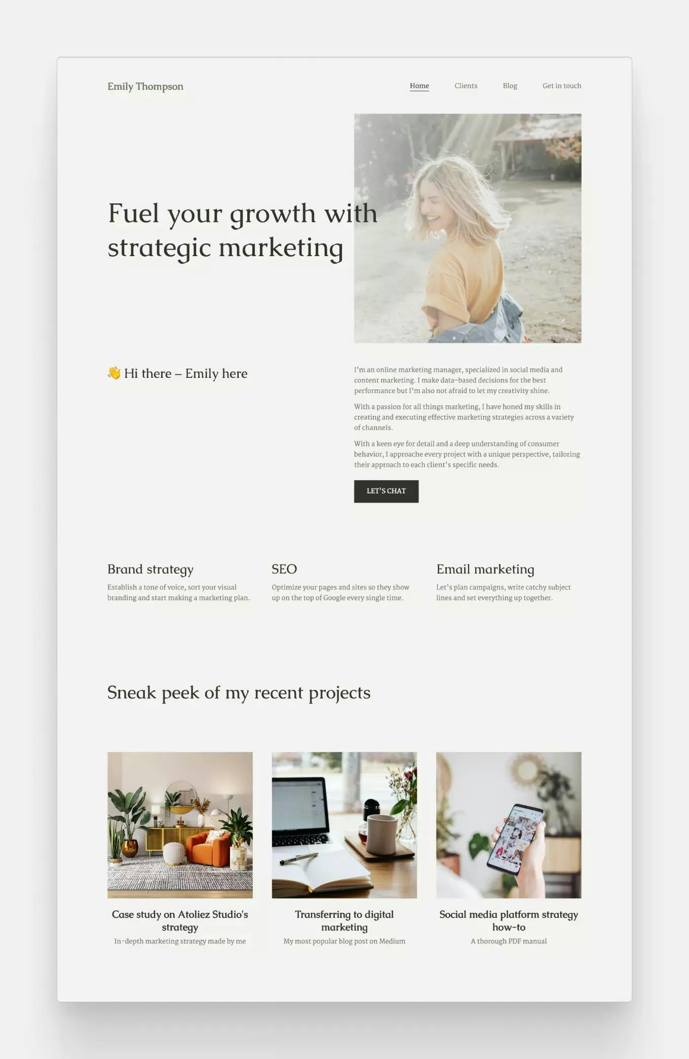
The “Journal” template comes with the tagline aligned to the left, with a bigger picture on the right that gets taller if you write more into its left-side counterpart.
Alexis Johns
As most people, Alexis uploaded a photo of herself as a profile picture to the main image in the hero section. By changing the default color to a light lavender color and matching her images to it, she created a youthful but elegant portfolio site.
Liked Journal? Click here to create a portfolio site with it for free!
For a fun and modern portfolio: Premier
One of Copyfolio's newest marketing portfolio templates is "Premier". It resembles "Journal" with the image on the right, but has a more fun and modern look with the tagline overlapping it a bit.
You don't have to worry about the visibility of your text though —we're adding a slight fade to your image automatically, to make sure your awesome tagline is still legible.
Dereka Smith
Dereka switched that default pastel palette to a darker one, entirely transforming the vibe of her portfolio website. She then added her top three projects in a grid, and her areas of expertise in four columns underneath. Then the glowing testimonials at the end really put the cherry on top.
Like the look? Click here and try this template for free today!
For bold first impressions: Billboard
Probably the boldest portfolio template, “Billboard” comes with a wall-to-wall background image for your tagline. It makes for a very visual site, but it also means that choosing the picture will make or break your first impression.
Copyfolio's updated "Billboard" template, now sporting a modern black background in its default palette.
Angel Suttle

The now-legacy version of the Billboard template features a big background image at the top.
Angel chose a black, pink, and purple abstract image for this background, which she coordinated with similar dark and modern pictures for her project thumbnails. Inbetween her tagline and projects, she added an about me section, and embedded videos she worked on to give a sneak peek before going into more details.
Liked Billboard? Click here to create a portfolio site with it for free!
For a simple but effective site: Brochure
John Ludlow
Brochure is a template with a dynamic hero. By that we mean that you can have it like John did, with just your tagline at the top. Or you can add an image to the left and crop it in any ratio you want, even a circle. The top section also gets a different background color, which depends on your chosen color palette.
Wanna see even more of these? Check our other post with more marketing portfolio examples!
Try one of Copyfolio’s marketing portfolio templates and create a site today
The hardest part is always getting started, but with Copyfolio, the website builder designed for writers and marketers, it really only takes a couple of minutes. Create an account, choose the template you liked, and you’re ready to go and make it your own.
There’s a variety of sections you can add, and all you have to do is fill them with content. You’ll never need to worry about sizing, padding, or adjusting it to be responsive. The editor does that all for you, so you can focus on writing and choosing the perfect pictures.
And to make portfolio building even easier, you’ll get tips and best practices in your inbox daily. Following them makes sure that the website you create will sweep everyone off their feet and convert like a dream.
Sign up to Copyfolio and create your marketing portfolio for free!
