9 Social Media Manager Resume Examples & How to Make Your Own
To run a successful social media campaign, you’ll need a solid strategy, great visuals, and compelling copy. The same is true for creating a social media manager resume —so don’t worry, you’ll nail it! Pair it with a convincing social media portfolio and employers will be fighting for you.
In this post, you’ll find everything you need to make a convincing social media resume: examples for inspiration, a how-to guide with all the must-have resume sections, mistakes to avoid, and more! So give it a read before you get to writing and hand in your new applications confidently.
Let’s start out by looking at some real-life resume examples from social media managers and marketers. All the resume pages you’ll see here were made on Copyfolio sites.
Lisa Vanthournout
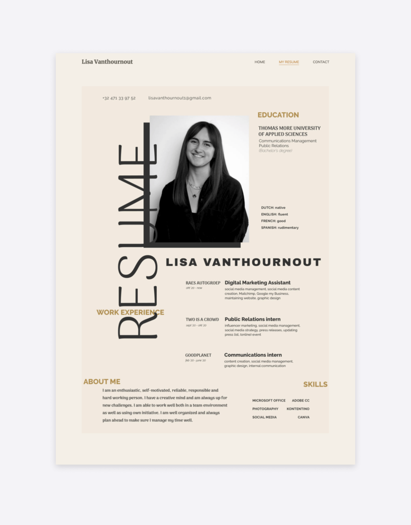
Lisa saved her resume as an image and embedded it into a dedicated “My resume” page on her site made with Copyfolio. She made sure its colors match her color palette so that it blends in with the rest of the site seamlessly.
She chose an unusual and unique layout with the different sections and elements scattered around. With that, it’s sure you’ll notice and remember her resume while reading through it easily thanks to the ample white space.
Michelle Boehm
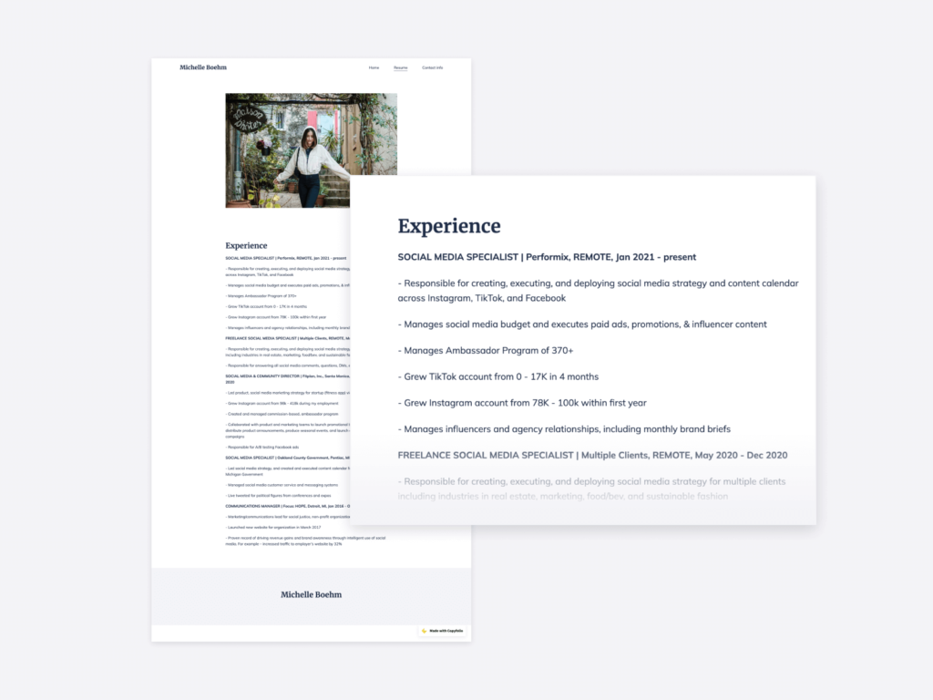
Michelle also added a dedicated resume page to her social media portfolio website, but she decided to simply type her resume in. This way it matches her site and personal brand 100%, and she didn’t have to worry about fitting into one page either.
On her resume page, she focuses on her work experience: listing each position with the company name and timeframe, and detailing her responsibilities and achievements with bullet points.
We love how she used numbers to underline her expertise and show the impact her work can have. She used Copyfolio’s Letterpress template to create her website and resume.
Carly Zumar
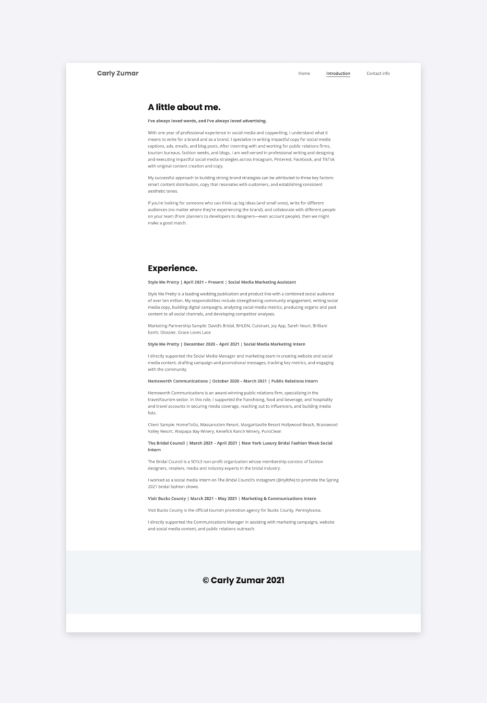
Carly decided to combine her introduction page with her resume. By doing that she’s helping visitors get to know her a little better before diving into the specifics of her professional history.
Learning about her expertise this way might not be as “skimmable” as a bulleted skills section, but builds rapport better, which can make a difference in the long run. And the resume itself is still easy to skim, having her previous jobs listed in reverse chronological order.
If we could add anything, we’d recommend adding an image, perhaps after the introduction, to make the page easier on the eyes overall.
Sara Nooraei
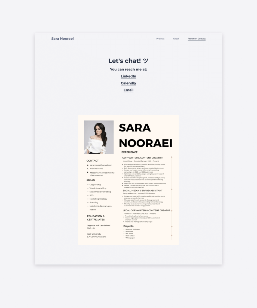
The introduction or about me page is not the only one you can combine with displaying your resume —the contact page could also be a great place for it. Sara saved her two-column resume as an image and embedded it on hers too.
The resume itself starts with the basics (her name, photo, and contact info), and goes on by lifting her skills and education on the left side, and her work experience on the right. The layout makes it easy to browse through.
We’d love to see a little more white place on the right-hand side —whatever doesn’t fit comfortably on the resume, can always go on your social media portfolio.
Stephanie Alkhoury
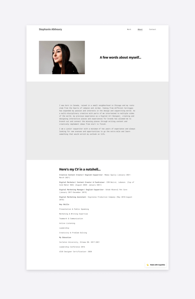
Stephanie’s social media manager resume is the third section on her about me page. She used a grey background to separate her introduction, then simply typed in her CV. As you can see, she started out by listing her previous job experiences, leading into her key skills, and ending with her education.
If someone just wants the gist, it’s easy to find and scan through —but if you’re interested in more details, you can just read the introduction first. In case you have your resume’s content written out, creating a resume on Copyfolio like Stephanie did will only take a couple of minutes.
Kassandra Coates
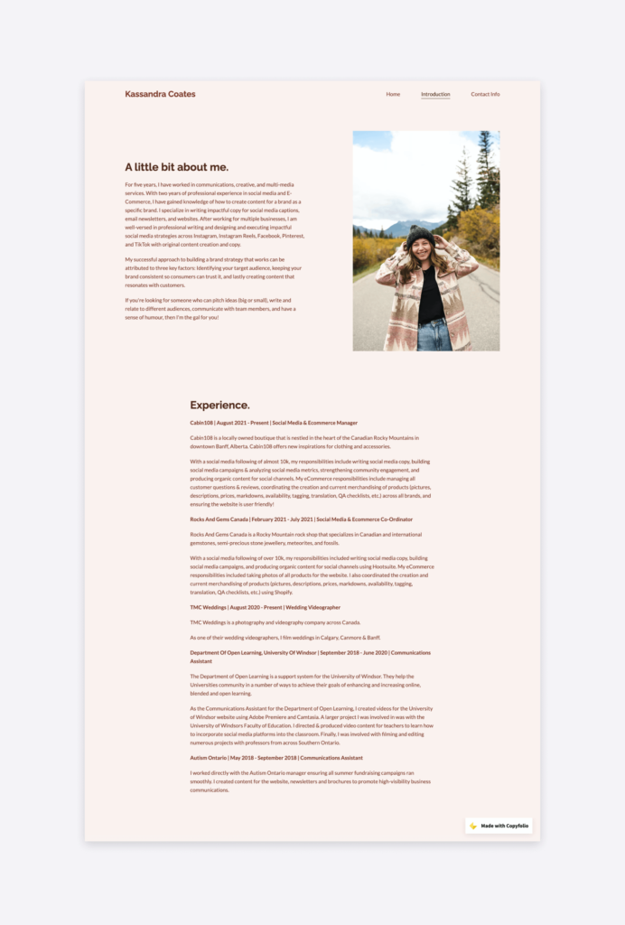
Kassandra wanted more color than a simple black-and-white theme would have —but without fiddling around with PDF designs. So she chose the “Chestnut” color palette and a picture of herself that matches.
With her CV, she decided to emphasize her work experience only. With the lack of social media programs in higher education and her skills showcased in her portfolio, that’s all the additional background info people will need.
Kelly McGreal
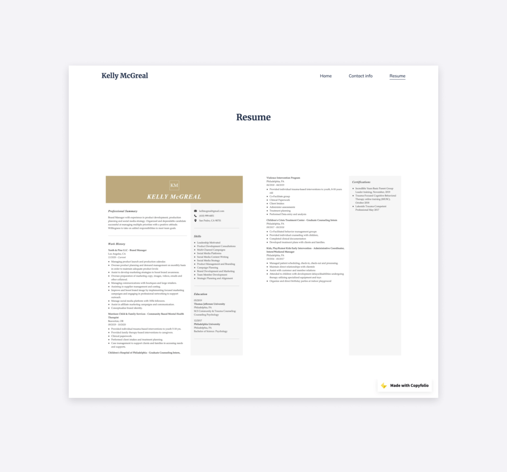
Kelly skipped the introduction and displayed her resume right away. She saved each page of it as an image and embedded them onto a new page on her portfolio website. With that, prospective employers can save it for later if they need to, and get to review her details in a familiar format.
She starts her CV with a professional summary, leading into her work history that continues on the second page. On the right-hand sidebar, you’ll also find her contact info, list of skills, and education history.
In case it doesn’t feel readable at first, just click on one of the images to open it in a bigger size, and zoom in if you need to.
Jackie Lewis
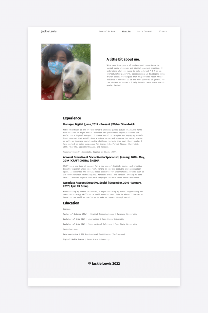
A picture of Jackie and her dog. Could a resume start off any better? Jackie opens her about me page with that and a short introduction section —kind of like a resume summary. She then leads into her work experience, clearly structuring it using different headings.
She ends the resume with her educational background, including both university degrees (hats off for the three diplomas!) and professional certifications. Everything that’s relevant, all on an easy-to-overview page.
Jackie created her social media portfolio and resume with Copyfolio’s “Typewriter” template.
Sandra Chung
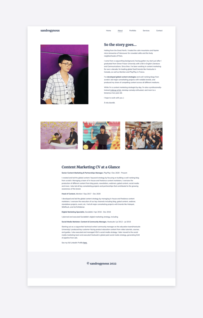
Starting out as a social media marketer for Hootsuite, Sandra has had an impressive career. Glancing at her CV, you can get a good idea of it all in a few seconds. Social media marketer at Hootsuite, digital marketing specialist at Sociabble, head of content at Mention, and now a senior content marketing manager at PlayPlay.
By using simple formatting and ample white space, Sandra gave us a quick but thorough overview of her career. And to make it even more fun to read and easy to digest, Sandra used pictures to break it all up. The pops of color on the white background draw your eyes and give them a break from reading the text.
And it was all made with 3 simple sections (an Image + Text, a Gallery, and a Text section) and just a few clicks. Effortless and beautiful.
— the essential sections you need to have
Browsing through some examples for inspiration is a great first step, but the work really begins when you sit down to write your own resume. To help you make it as quick and easy as possible, we collected the sections you need to have on yours.
Go through the list and write them as you go. You won’t even notice the work and you’ll be done before you know it.
What does a social media manager do and how to describe the role on a resume
First things first: how do you explain this role on a resume? As it’s still a relatively new area, some people are not clear about what social media managers do and what it means when they have that position in their CV.
Social media managers can have many different responsibilities —and that’s why it’s important to write about the specific ones you had. You can do that in your summary and work experience sections, but more on that in a bit.
In general, SMMs take care of a company’s social media presence and activities. That can involve things like:
- setting up their profile on different platforms,
- establishing the overall social media strategy,
- planning a content calendar and executing it,
- running giveaways and other interactive activities,
- conducting hashtag research for the best organic reach,
- engaging with their audience through comments and messages,
- running promotional campaigns, organically and via ads, and
- monitoring brand mentions and collection of UGC content.
It’s quite a list, isn’t it? This is why it’s important to highlight which areas you’ve done and are an expert in.
The resume summary or objective
You can do that right at the beginning, in your social media manager resume summary or objective. The difference between the two is that while the former talks about what you have under your belt already, the latter describes what you’re aspiring to achieve.
Some people completely skip this —but some decide whether to keep reading solely based on it. So just to be sure, write it well. How?
In two or three sentences, sum up your expertise, mentioning your top skills, and some specific numbers too if you can. For example:
“Social media manager with 5+ years of experience in helping startups in the fitness niche organically grow their audience. By establishing their social media strategy utilizing UGC, I helped XYZ build an engaged follower base of 450k across three platforms within 3 months.”
Previous work experience
The resume section most people will be interested in will be the one about your work experience. This gives them an idea of your level of experience and seniority, and they’ll want to see if the work you’ve done before is relevant for their open position.
For each job, make sure to list:
- your specific position or job title,
- the name of the company,
- the date of when you worked there,
- and a short summary of your responsibilities and achievements.
In the short summary, make sure to use action words like launched, generated, implemented, developed, or analyzed for a bigger impact.
Social media manager skills
It’s hard to fit every valuable skill into a short summary and a few work experience bullets. That’s why every social media manager has a skills section on their resume. It’s a simple, easily scannable list with a good mix of soft and hard skills.
Here you can mention specific software you mastered, social media platforms you’re an expert in, or areas within social media (e.g. strategy, content planning, ad campaigns, etc.) that you’re familiar with.
This is also the place where you can highlight your leadership or communication skills, or anything else that’s not strictly related to social media management, but can help you stand out amongst the other candidates.
Your educational background
Since there aren’t many social media-specific degrees around yet, the educational section has been becoming more and more negligible for social media manager resumes. So especially if you have solid experience and successful projects to show, consider leaving this one out.
If you do have a degree in something related like marketing, communications, or media, you can definitely include it still. Also, if you’ve completed any online certifications, feel free to add them to this section of your resume.
Your contact information
This is the least creative and time-consuming part of your resume, but it’s just as important as the others. If you convinced the hiring manager with the CV and attached portfolio, they’ll want to reach out. But if your contact info is not easily accessible, they might just put your resume to the side to “come back to it later”. And that’s how applicants get forgotten.
Should social media managers attach a Cover letter or portfolio with their resume?
As with a lot of applications, the first part of the answer is: it depends. It depends on what is expected and stated in the description. If a company specifically asks for a cover letter, attach one. Not reading the requirements and following these simple steps would make a bad impression right at the start.
But if they’re not specifying the materials, go for an online marketing portfolio instead of a cover letter. Why?
Because it gives you the space to not only explain whatever you’d write in a social media manager cover letter but to underline that with case studies and work samples as well.
How to create a social media portfolio easily
Don’t worry, creating a social media portfolio is actually pretty quick and easy. If you choose the right tool, that is.
With Copyfolio, setting up a starter portfolio website will only take a couple of minutes. You sign up, choose a template, and you’ll get a site with three pages. All of these pages are filled with either example sections or guiding questions to make completing them even faster.
On your homepage, you can add projects that can either be PDF files, external links that open in new tabs, or case study pages. In the latter, you’ll find more guiding questions. Answer them, and you’ll have an optimized case study written out in under 10 minutes.
5 mistakes to avoid when making your social media manager resume
Having the right sections won’t guarantee that your social media manager resume is convincing and successful. There are a few common mistakes people make when creating theirs —these are what we’ll go through next.
Read carefully, so you won’t have to learn from your own mistake, and can avoid them in the first place.
When it comes to social media, it’s enough to make one small mistake that goes viral to ruin your reputation. And while it’s hard to convince potential employers that you never let typos slip through… having one in your own resume is guaranteed to undermine any chances for that.
So make sure you not only proofread both your resume and portfolio before submitting them but that you asked at least one other person to help you do so too. When it’s your own writing and your brain knows what’s supposed to be there, it’s hard to spot small mistakes. Therefore having another set of eyes can be a tremendous help.
While you have the space in your portfolio to elaborate on your achievements, not mentioning any stats in your resume is still a big no-no.
Since your resume might be the one recruiters see first, it’s important to make sure it catches their attention. And what would be better for that than numbers proving the business value of your work?
Include the most impressive one in your resume summary, and mention at least one or two in each job description too.
Since you’re researching resumes, you must have heard about customizing your CV for each application. We stand by that advice, as writing a resume that’s too general, and submitting it everywhere is one of the big mistakes social media managers make.
Make sure to thoroughly review the job ad and reflect the skills and values the company expects on your own resume. Then repeat this process for your different applications and hand in a version of your resume that’ll resonate best with that company.
Recruiters don’t have much time, we know that. And as the purpose of checking your resume is to get an initial impression of the candidate’s qualifications, they won’t want to spend much time reviewing it.
Don’t let your social media manager resume run too long —try to fit it into a single page. If that feels stressful, just remember: the CV is to catch their attention only. They can check out all the details in your portfolio next.
The last common mistake we’d like to highlight is choosing a hard-to-read format, which often has a lot to do with trying to cram too much information into the resume.
When you’re creating or reviewing your CV, always ask yourself: does it look like something I’d be happy to read?
If the text is suffocated with no white space, the letters tiny, and the order confusing, recruiters will just toss it away. So wouldn’t it be better to include less but give it a better chance of actually getting read?
You can check the above examples or some social media resume templates to find a format and design you think would work for you.
How to choose the best social media manager resume format
Speaking of formats: what are the possible and best formats for a social media resume?
While the design of your resume affect the overall format too, in this section we’ll talk about the logic for organizing all the information that gets displayed and the format it gets saved or presented in.
Functional vs. chronological
Let’s start with organizing all your information. There are two main ways for that on a resume: functionally and chronologically.
The most popular one is the latter —or a reversed version of it, to be exact. Creating a reverse chronological social media manager resume means listing your past work experiences starting with the most recent one, going back in time.
That works amazingly for people with a nice list of full-time positions. But for students, juniors, or freelancers? Not the best option. For them, creating a functional resume is the way to go.
In the functional resume, you list the skills and types of tasks/jobs you’ve done and you excel at. With each, you can add more details such as certifications in the topic, clients you did that for, or achievements you have in that area.
PDF vs. online resume
A few years ago, saving and sending your social media resume as a PDF was a no-brainer. But these days that’s not the only option —especially if you want to stand out from the crowd.
Another option would be to have your CV online, ideally on your portfolio website. It gives you more space to write down everything you find important, without worrying about space limits.
If you find that companies you apply to want you to upload a PDF, but you like the online approach too… Just have both and get the best of both worlds. Create a condensed version that you save as a PDF and have a longer, airier, and digestible one online.
Just make sure that you link your website in your PDF resume, so people can easily go and check all the additional info. Help them explore your expertise and build better rapport and personal connections.
