Everyone’s favorite part of building a copywriter website is checking out examples and gathering ideas. If you’re in need of a boost of inspiration and a little help with building yours, look no further. We’ve brought you 9 stunning copywriter website examples and will walk you through what makes each worth following. Then we’ll give you a simple 5+1 step guide to build your own website easily.
9 copywriter website examples
A little note before we get into it: all of these examples were created with Copyfolio, a website builder designed for copywriters. We’ll tell you what template each of them uses, so you can recreate them for yourself easily.
1. Kaylan Thompson

Kaylan used Copyfolio’s “Journal” template to create her copywriter website.
We love the way Kaylan’s website draws and leads our eyes along her page. The first thing you see is a stunning, smiling photo of her, which immediately makes the site feel a little more personal.
Then your eyes will wander to her tagline, which will tell you who she is: a story-driven, interview-based copywriter and content strategist. Having your profession and specialization spelled out right at the top as she did is essential. People decide whether you’re a potential fit in the first 5 seconds, so you need to make it clear what you’re all about.
Kaylan then goes into even more detail in her about me section, showing us glimpses of the person behind the professional title. But the aim of a copywriter website at the end of the day is to sell one’s skills and expertise, so she also added a portfolio section to the bottom of the homepage.
2. Gina Arnold
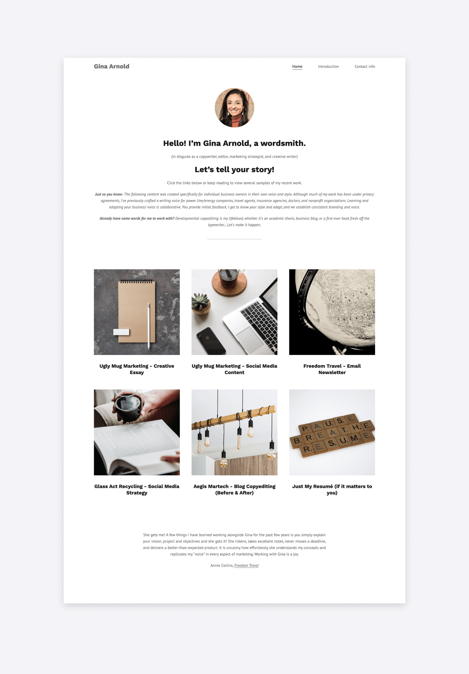
Gina’s site uses Copyfolio’s “Letterpress” template.
Gina’s website looks great, with a nice layout and carefully chosen, matching pictures. But what we want to highlight is the incredible copy she has all throughout.
When it comes to copywriter websites, people have high expectations for everything they read on there. So having impressive writing samples won’t be enough —you have to make sure each and every word you type out is up to par.
Our favorite line from Gina’s page is her greeting tagline with the little addition. It says:
Hello! I’m Gina Arnold, a wordsmith.
(In disguise as a copywriter, editor, marketing strategist, and creative writer)
Using the phrase wordsmith can be a bit cliché on writer websites if not used carefully. But with that complimentary sentence, Gina balanced it beautifully.
3. Sarah Fitzgerald

Sarah chose the “Billboard” template to build her website.
Contrary to the first two examples, Sarah opted for going without a portrait on her website’s homepage and chose an image of soft shadows on a wall instead.
If you scan Sarah’s website, you can see it’s more than just a simple portfolio. It’s a proper copywriting business website.
Right underneath her website hero (that prominent top section), she writes about her process when it comes to working with clients. Not only that, but she also has a separate services page, alongside ones writing about her previous projects, and clients.
And did you notice that she customized her meta titles and descriptions? Completing SEO settings like that will help her find new clients not only through networking but organic search as well.
4. Alaina Thomas

Alaina built her site with Copyfolio, using the “Journal” template.
Oh, the power of visuals and a strong personal brand! Alana’s portfolio website is the perfect example of how much it can elevate your site. What do we mean by that?
- The color scheme. Alaina uses black, white, and beige-brown tones only. All the photos she uploaded, as well as the decorative backgrounds she used, follow the same palette.
- Design elements. Notice how she added drop shadows to some of her photos before she uploaded them? Or how she designed a section of text, adding it onto a custom background in her about section? These are all little things, but they make a big difference.
- Matching, but not identical visuals. Using custom backgrounds for your sections is the first step. But going the extra mile and making sure they coordinate but are not the exact same is what’s going to make your site truly stand out.
- And of course, the tone of voice. Having witty copy on your page is one thing, but writing with a consistent tone of voice puts the cherry on top.
5. Savannah Fonseca
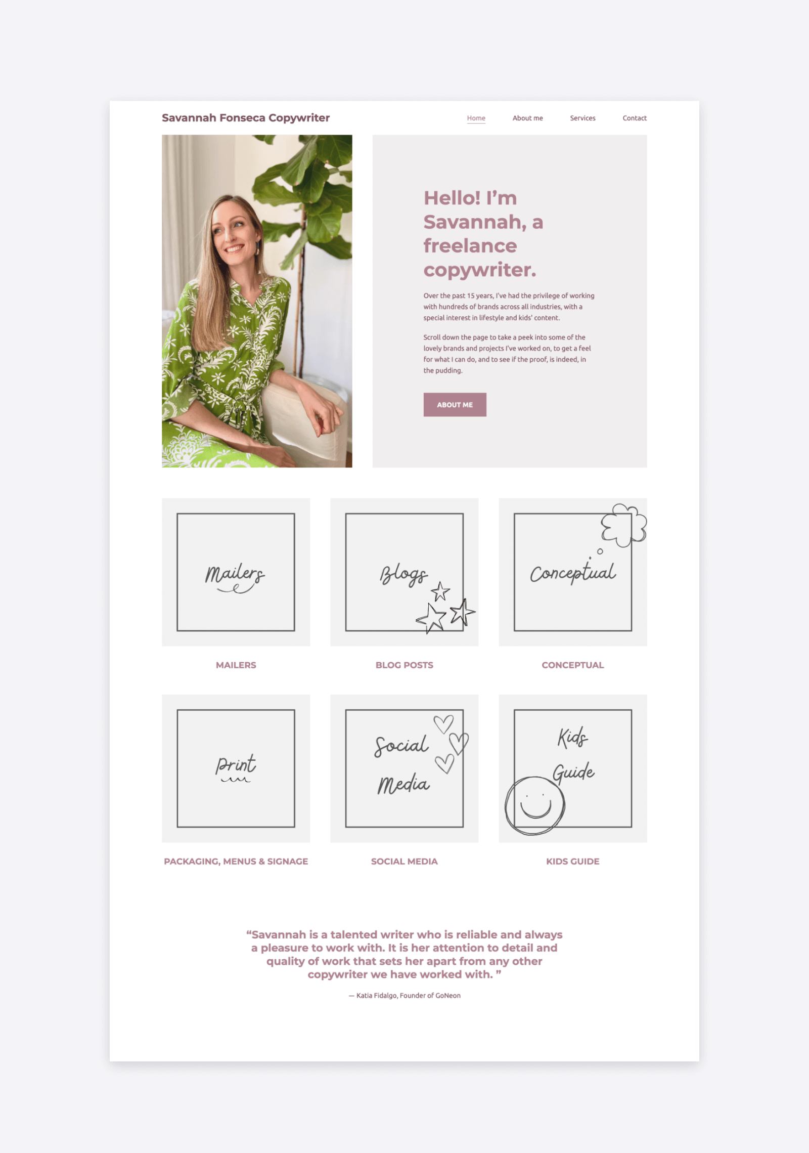
Savannah used Copyfolio’s “Agenda” template to create her site.
Savannah’s copywriter website follows multiple of the best practices we just outlined.
She writes right at the top, with big bold letters, that she’s a freelance copywriter. Uploaded a picture of herself and makes a lovely impression. Then added custom thumbnails that represent her playful personal brand. She also hasn’t missed creating a separate page for her services, so people can get to know her business after checking out her work.
6. Stefan Kalpachev

Stefan’s site uses Copyfolio’s “Typewriter” template.
Copyfolio has a big variety of color palettes to choose from, but copywriters seem to favor the black and white palette called Ink. Stefan chose this one as well, but not because he’s afraid of using colors.
He decided to use a bunch of different colors for his project thumbnails —and the crisp white background of his site really makes them pop. Not to mention that any colored background would probably clash with some of them, making it impossible to display such a nice variety of thumbnail colors.
But let’s take a closer look at Stefan’s projects. For their titles, he simply wrote the type of the project: B2B landing page, direct sales email, LinkedIn post, etc. He also not only used screenshots to illustrate them on the thumbnails but added them all to mockups, for a perfectly polished, professional look.
7. Eliza Jackson
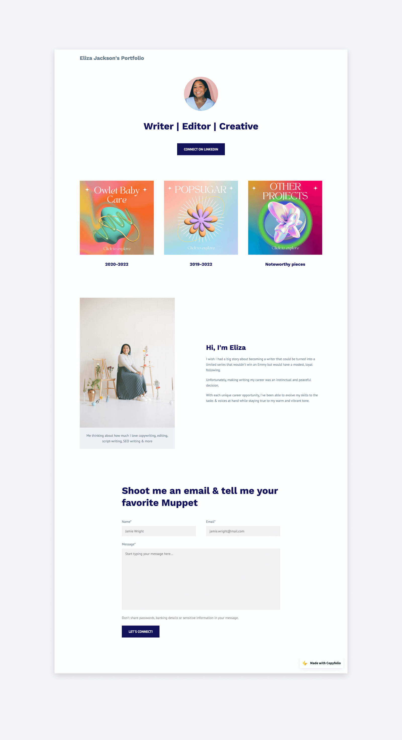
Eliza chose the “Letterpress” template to build her website.
You can see that Eliza’s a cheerful, upbeat person from the first glance at her copywriting portfolio website. She uploaded a photo of herself to the top —a small picture, but with a big big smile.
She displays her work quite high on her page, separated into three categories: two based on dates and an additional of noteworthy pieces. And the thumbnails? They’re quirky and super colorful.
The way she did the layout of her site and the images she chose show perfectly how you can create a sleek, professional copywriter website without it looking too stern or sterile.
8. ATaylor Copywriting
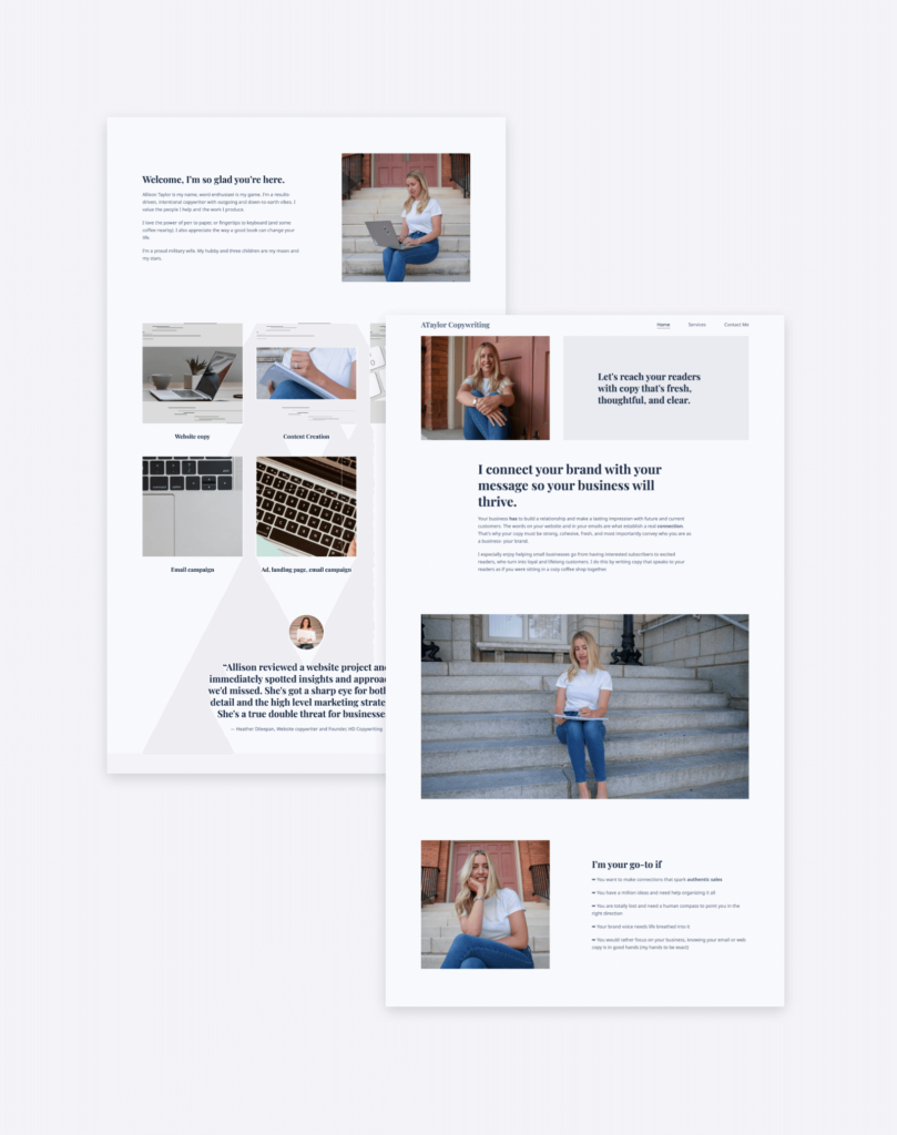
Want to create something similar? Try the “Agenda” template on Copyfolio.
Allison Taylor’s website sets a perfect example of thoughtful copy that makes an instant connection with the reader. Next to her picture, she starts out her page by writing: “Let's reach your readers with copy that's fresh, thoughtful, and clear.”
She then goes on to write “I connect your brand with your message so your business will thrive”, and wouldn’t you be sold by then if you were out here looking for a copywriter?
She also lists out reasons she could be a perfect fit for you, writes more about herself, and showcases some of her best writing samples. Topping it all with a testimonial and ending with a strong CTA, we can confidently say, it’s a well-rounded and efficient copywriter website.
9. Chiah Ruey Chee
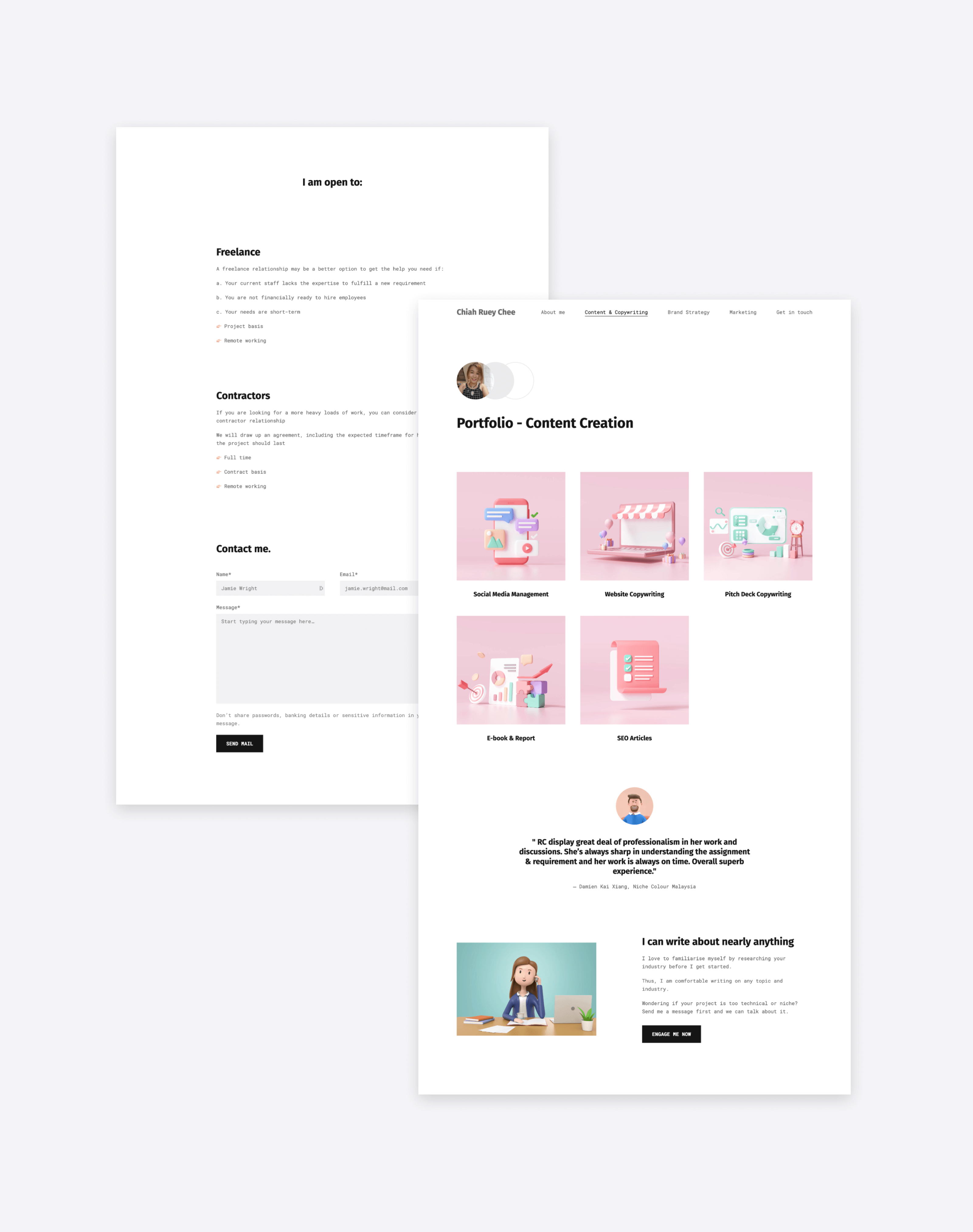
Chiah used Copyfolio’s “Typewriter” template to create her site.
Let’s take a closer look at Chiah’s website structure first. She has multiple pages, but she made her copywriting and content creation portfolio her homepage —which shows us that this is what she put her focus on.
The spotlight is definitely on her projects, although she has lots more content as you scroll down the page. She has a testimonial from a previous client and a section writing about her expertise. Chiah then explains the kind of freelance and contracting opportunities she’s open for. It helps visitors make sure the arrangements they have in mind fit what she’s open to.
What can you learn from that? The more necessary business-related information you display on your copywriter website, the less unnecessary messaging you’ll have to get through.
What’s the best platform for your copywriter website?
After browsing through these copywriter website examples, you might have a vision in mind about what you want yours to look like. But before you could jump into it, you’ll have to decide what platform to build your site on. So let’s see the 3 most popular options amongst copywriters.
Social media platforms like Instagram
It’s not so much of a proper website, but some copywriters like to have their online presence on social media only. It means no time needed to set up and build things —all you have to do is upload what you have.
On Instagram, you can post images and screenshots of previous projects, while on LinkedIn you could link out to them or type them out.
The downside is that customizations are very limited and it’s not very professional. And on top of that, you’ll have to keep up with the algorithms if you want people to actually find your content.
Self-hosted website builders like WordPress
The opposite end of the spectrum would be a self-hosted website, created with a CMS (content management system) like WordPress. It’s the exact opposite in a way that it’s quite complex and difficult to set up, but allows for all customizations you could possibly need.
To have a website like that, you’ll have to purchase hosting and a domain name, then install WordPress on your server. You’ll then have to choose your theme, install plugins, and get to work —which often involves quite a bit of coding.
The end result can be a super custom website. But if the execution is anything less than perfect, you might actually end up with one looking… not so professional. So if you decide to do it this way without any experience in web design, we recommend you get help from a professional UX design company, a freelance UX designer, or a web designer.
A no-code website builder for copywriters like Copyfolio
If you want a professional-looking website without technical struggles, choosing a website builder created for copywriters like Copyfolio is the way to go. For you, that would mean:
- an easy setup and no fussing with hosting or code,
- templates that were designed for writers just like you,
- one-click mockups to create professional graphics within the editor,
- help with writing case studies in the form of prompts and guiding questions,
- a simple way to showcase PDF projects and ones published elsewhere online
- a sleek, automatically responsive design without having to adjust elements one by one, and more.
You could still get your own domain, and customize it to fit your personal brand —just without all the extra unnecessary options and complications. Want to know how to create a copywriter website this way? Keep on reading then!
How to build a copywriter website in 5+1 steps
With the right website builder, creating a website isn’t as overwhelming as it might feel at first. After signing up (which takes about 2 minutes in Copyfolio), you get a simple site setup for you with 3 pages, ready to go. From there it takes 5 (+1 optional) steps to create a complete copywriter site.
Step 1. Setup your homepage
First impressions are crucial, so we recommend you start with and spend the most time polishing your homepage. The most important aim of it is to tell visitors who you are and what you do. To do so, write a tagline that encompasses that (you can get inspired by the copywriter website examples above) and upload a nice photo of yourself.
To establish your authority and expertise, add logos of previous clients to the homepage, and display at least your top 3 projects here too. For added credibility, you can also showcase a testimonial or two.
Step 2. Add your portfolio
There are generally two ways how copywriters like to display their portfolios on their websites.
One would be selecting their best 4-6 projects and adding them to their homepage. You can see this on sites that focus more on showcasing work and not so much on introducing services.
The other approach is creating a separate portfolio page and adding all of the projects there. Even if someone goes this route, they might still display their top projects, the best of the best, on the homepage, as a sort of teaser.
There's no right or wrong way, you'll see both if you check out some copywriting portfolio examples.
How to showcase copywriting projects in your portfolio
It’s super easy to showcase your projects in Copyfolio. Just add a portfolio section wherever you want it to go, and click “Add project”.
There you can choose from three formats. You can:
- create a case study page to write more in detail about what you did and how it turned out,
- upload a PDF if that’s how your writing samples are already saved, or
- add an external link that opens in a new tab, if you have work that was published elsewhere online.
Choose a nice thumbnail image for each, publish them all, and you’re good to go.
Step 3. Write your about me page
Once your homepage is done and you’ve uploaded your portfolio, it’s time to move on to your about page.
Some copywriters actually skip this page and opt for adding a little about me section to their homepage instead. But if you want to go more into details, and perhaps showcase your copywriter resume, we recommend creating a separate page for it.
It’s the perfect place for giving a glimpse into the life of the person behind the copywriting genius. You can share your mission, vision, and what you stand for, as well as details about your work history that could be relevant to your potential clients.
Step 4. Add your contact info
We say a copywriter website is successful if it catches visitors’ eyes, holds their attention, then drives them to take action. The action we want here is to get in touch with you, hopefully about new opportunities.
But they won’t be able to do that if your contact info is too hard to find. We recommend two things to help with that:
- Create a contact page. By now everyone’s used to websites having one, so people will be looking for it when they want to reach out.
- Add your contact info to the bottom of important pages. It’s convenient for people that just finished scrolling an interesting page —all they’ll have to do is click the email link or send the form, without searching anywhere.
Step 5. Get a domain
To put the cherry on top and make your website truly professional, you’ll need your own domain. Copyfolio makes it super easy: just search for the name you want, click purchase, and it’ll automatically be connected to your site.
Have a domain elsewhere already? No problem! You can also connect that instead.
As a best practice, try to get your own name as a domain. If it’s taken, you could add something writing or copywriting-related to the end of it. Alternatively, you can explore different endings too other than “.com”.
Step +1: Showcase your services
You don’t have to be a freelancer to build a copywriter website, but if you are, this last extra step is also essential for you. While for in-house copywriters, employers set the requirements, freelancers won’t take any and every kind of copywriting project.
Showcasing your services will help potential clients figure out if you provide the kind of services they’re looking for. It creates better expectations for them and brings in more high-quality clients for you.
Create your copywriter website easily with Copyfolio
Ready to jump in? Click here to sign up for free and get started with Copyfolio!
Want to see how it works in action? Check out a real-time recording of creating a copywriter portfolio website with Copyfolio in 8 minutes!


