How to Create Author Websites Easily + 11 Examples
When you think of books, you typically think about hardcovers and paperbacks and an industry very much still relying on print. But technology improves, and just as ebooks are becoming more common, authors can’t rely only on traditional, offline ways for their representation either.
The most important cornerstone of a writer’s online presence is their author website –and in this blog post, we’ll go over everything you need to know about creating one for yourself. Because with the right tool, it’s actually really quick and easy to build your own website.
Why are author websites essential?
So how is it that nowadays it’s not enough to have an agent and a publicist anymore?
The answer is really simple. You just have to think about the simple habits we all have. When you hear about something new, or when you want to learn more, what do you do? You Google it. That works the same when it comes to other people wanting to learn about you or your books.
And sure, if your books are sold by vendors online, people will find them there… But what about you? Wouldn’t it be much more professional, if your author website came up instead of your personal social media profiles you don’t even want people to see?
Your website is the key to establishing your author brand
As an author, you have to think about your online presence the same way any other brand would think of theirs. The way you appear online and communicate with your audience will influence the way people think about you, and in consequence, about your books.
Since the overall goal is to market and sell your books, it’s essential to properly establish and maintain your author brand. And your website plays a key role in that. It should reflect the personality and character of you and your books in the messaging and the visuals as well.
What do the best author websites have in common?
Although each author website is unique, as they represent a certain author and their personal brand, there are certain things that the best author websites all have in common.
The best sites are fast and responsive
As much as a book is about the readers’ experience, websites are all about the visitors’. One of the most important factors for that is the loading speed and the responsiveness of a site. Again, thinking about your own internet use, if you have to wait long seconds for a page to load… You might just click away instead, ‘cause who has time for that?
The same goes for responsiveness, which means whether a site adapts well to being displayed on mobile devices. People browse more from their phones than ever, and it’s not rare for websites to get over half of their visitors from phones and tablets. So it’s crucial for sites to adapt and not fall apart on mobile screens –which, sadly, still happens to way too many websites these days.
Where are we going with this? Just make sure that your author website loads fast and looks great on every possible device. The easiest way to accomplish this is by choosing a website builder for authors that guarantees it.
Less is more: great author websites have a clean design
The second thing that the best author websites have in common is that they follow the “less is more” rule when it comes to their designs. This is true for the number of colors and fonts they use and the amount of text they feature on their pages. But more on that in a second.
In order to keep the look of a website clean and cohesive, it’s best to choose a limited color palette of a maximum of 3-4 (coordinating) colors to stick to. You can choose one to use as your background, one for the text, one for links, and another additional accent color when you want to really highlight or emphasize something.
The same goes for fonts, except with an even more limited number. Choose and only use 2 different fonts throughout your website to keep the design cohesive. It might be tempting to set all different fonts on different pages and sections, but it’ll only make the site look cluttered and all over the place. So as a best practice, choose one font to use for your headings and one for your body copy. Luckily, finding the best author website template can make implementing that pretty easy.
Implement the power of white space and let your text breathe
The less is more rule is just as true for the amount of text you add to each page, as it is for the colors and fonts you use.
As an author, it’s easy to get carried away with words, when writing copy for your website. But yet again, you have to think of the people who’ll be visiting your author website and reading what you wrote there. If they’re met with a wall of text, they might get intimidated and leave right away.
So be conscious about how much you write on your site –and even if you have lots to say, try to break it up into multiple smaller sections. The key is for each section of text to have enough white space around it. Then the page will feel more breezy and much more inviting to read.
They are all easy to navigate
The last characteristic we’d like to highlight is easy navigation. When someone visits your website, they shouldn’t feel lost or confused, or they’ll quickly click away. So you need to make it easy for them to find whatever they’re looking for –highlighting whatever you would like them to see and read.
The first step and the easiest way to do so is with your menu or navigation bar. This is typically located at the top or the side of your author website. It should display the most important pages: your about and contact pages and a way to navigate back to your home page.
Other than that you can place links and call to actions (or CTAs) throughout your pages to help your visitors navigate your site.
What should author websites include?
All that we just went over is about the look and the mechanics of your site. But you’ll have to fill it with content too. So what should you include on your author website? Let’s review that next.
Feature your author bio on your site
This probably goes without saying, but your author bio should have a prominent place on your website.
Prominent, but not primary though. Create a separate about me page for this purpose, don’t just write it all on your home page. Doing that would clutter up the home page and take away from the ease of navigation on the site.
As you know, an author bio is typically:
- no more than 150-200 words,
- written in the third person,
- including your byline,
- a bit about who you are,
- what kind of books you write,
- and why people should pick up your books (think achievements and awards here).
But since we’re talking about your own website now, after featuring this shorter, more professional version, you can add some more information to the page if you’d like. Providing some exclusive information for readers that they can’t find elsewhere can add lots of value to author websites.
Add each of your books to separate project pages
Even though your visitors will definitely want to learn more about you on your site, the overall purpose of it is to get them to buy your books. So featuring your books is a non-negotiable, when you’re thinking about what to include on your author website.
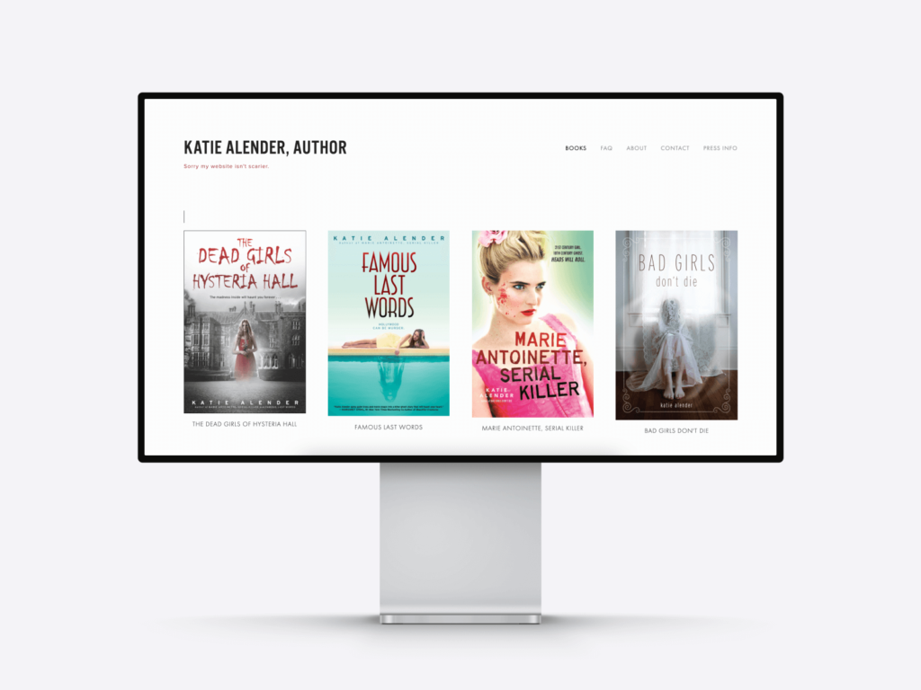
As a best practice, feature each book (or at least the top 3-5) on your home page as thumbnails. Then create a separate page for each book that people can visit by clicking on their respective images. Essentially, it’s just like any writing portfolio, except here your books will be the writing projects that you’re showcasing.
You should feature the following on each of these pages:
- The title of the book (obviously)
- A picture of your book, ideally its cover image
- The blurb or short description of what it’s about
- Any awards or achievements, e.g. becoming a bestseller
- Recommendations and quotes, especially from other well-known authors in your niche, if you have any
- Links to where people can buy the book
Optionally, you can include more information you’d typically find on a vendor’s page too, such as the year the book was published or the number of pages it has, and so on. You can leverage a website page counter to know the pages on your website.
Make sure people can contact you easily
One aim of author websites is to send people to buy the books featured on them. But another just as important purpose is building your author brand. And as that revolves around you, when someone likes what they see, they’ll most likely want to get in touch with you.
It goes without saying that you should make it as easy as possible for them. The best way to do that is by adding a contact page to your website and linking to it from your menu.
On your contact page, you should feature the method you prefer for them to get in touch with you. It can be your phone number or email address –and if you’re accepting fan mail, you can add your designated mailing address (e.g. P.O. box) here too.
Consider adding a media info page
You should also consider adding a media page with all the resources and information media outlets might need about you and your work. If they want to feature you in a piece, having those ready for them to cite and download will both make their work easier and save you time on constantly having to send the same things over.
Or if you have an agent and/or publicist, you can add their contact information, asking media outlets and journalists to reach out to them instead.
The 11 best author websites: examples you should check out
Just like with writing, inspiration can help a lot when it comes to building your website. So we reviewed dozens of author websites and chose the absolute best ones that satisfy the criteria we outline above. Look through them for some great examples to follow.
Katie Alender
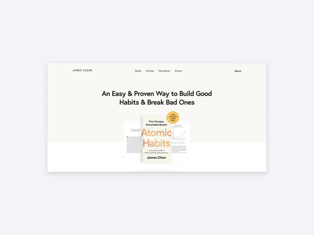
James Clear
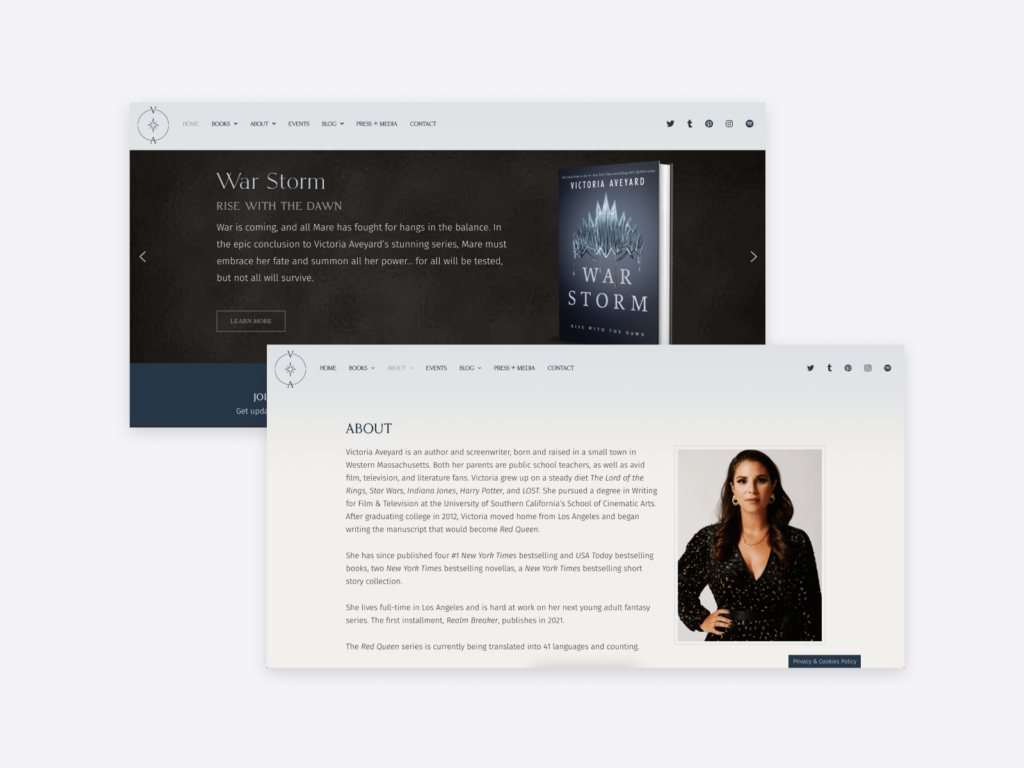
Victoria Aveyard
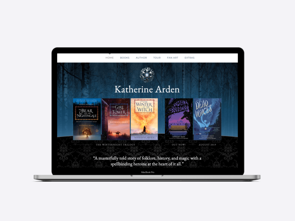
Katherine Arden
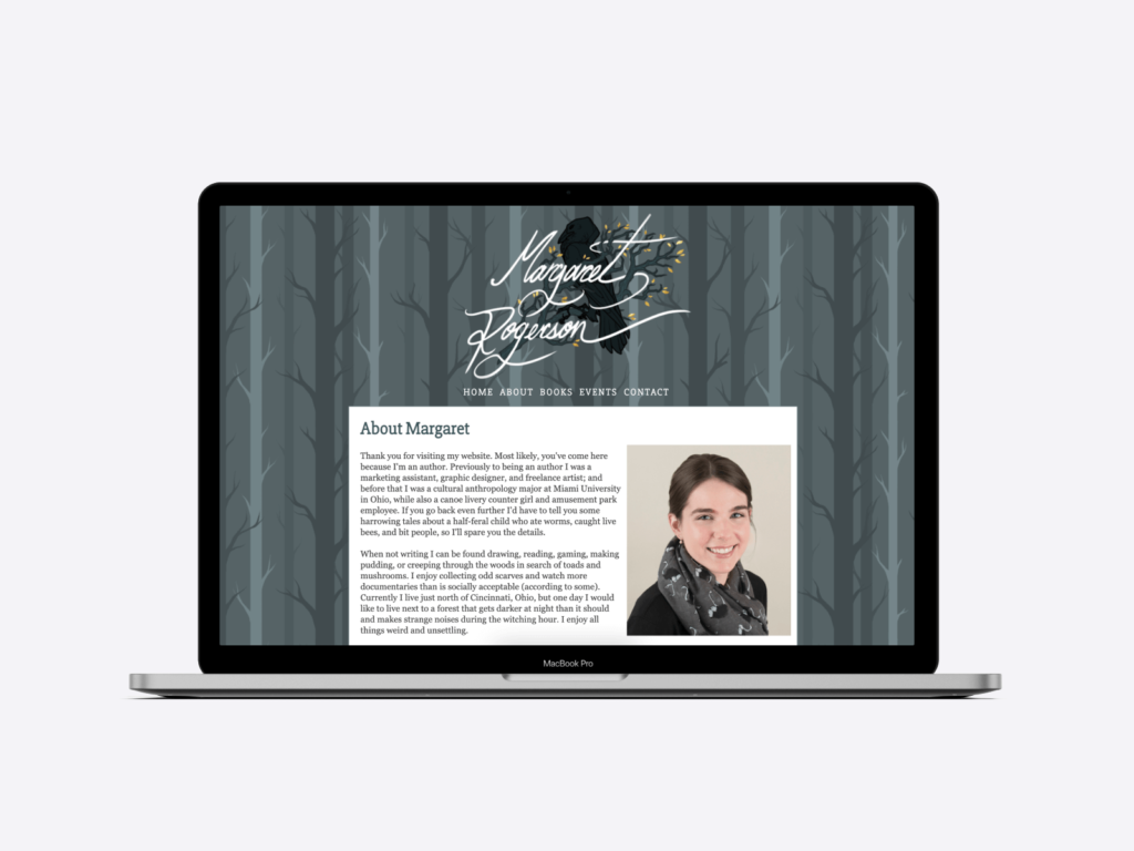
Margaret Rogerson
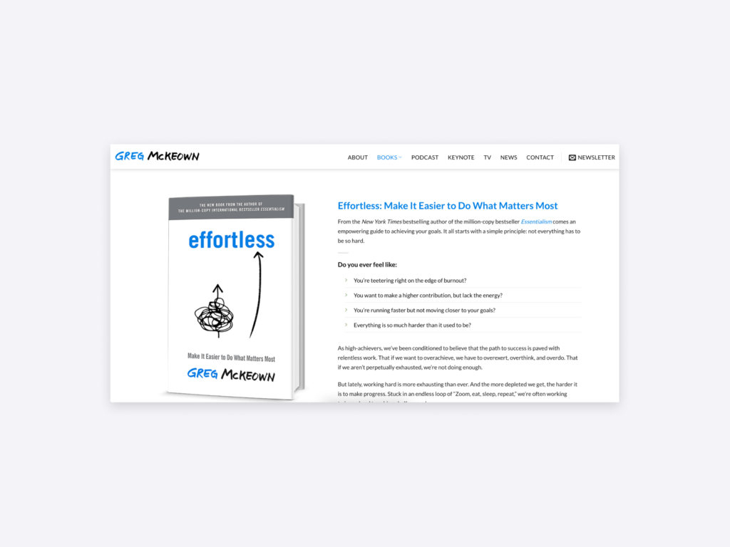
Greg McKeown
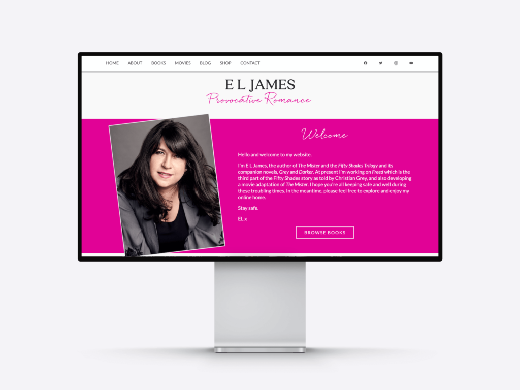
E.L. James
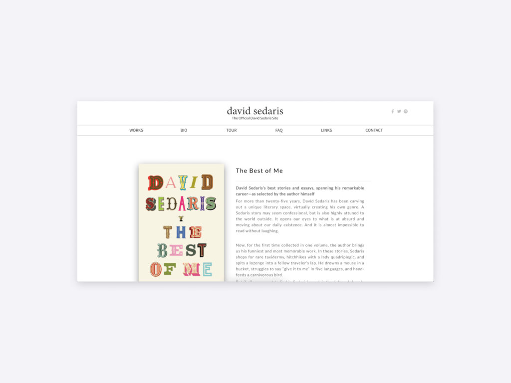
David Sedaris
Kate Morton

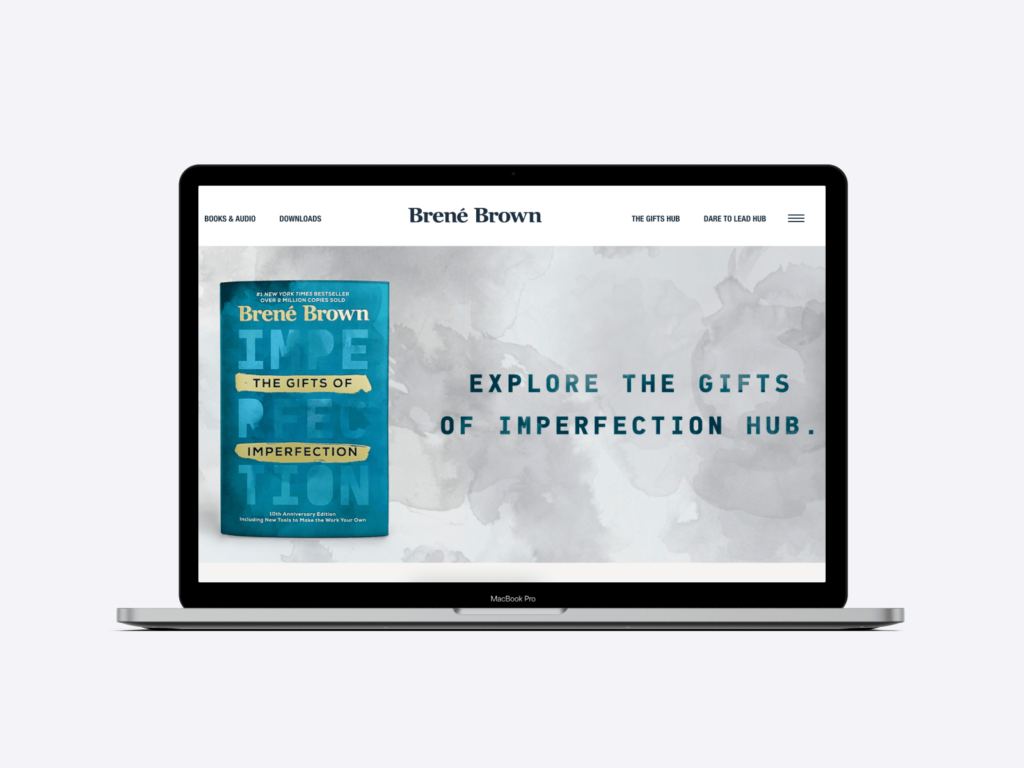
Brene Brown
Mark Manson

How to easily create your author website with Copyfolio
The key to building an author website that checks all the boxes is choosing the right tool. A tool with which your site will look polished and professional, without spending hundreds of dollars and hours on end on it. You should choose a writer website builder that:
- Automatically makes your author website responsive
- Loads fast and is easy to use, requiring no coding skills
- Saves you time on design with palettes and presets
- Helps you out with templates, prompts, and other useful resources
With Copyfolio, you can build your entire website in under 15 minutes, because it does all that.
Once you sign in, your site is set up with the three most important pages: home, about, and contact; and pre-filled with some sections to give you some inspiration. You can delete them all and start anew, or simply customize their content to be done in no time.
Add a page for each of your books by adding a new project, featuring them prominently on your home page, exactly the way it’s recommended.
You can customize the look of your site easily, with a few clicks:
- Feel free to switch templates anytime, even if you’ve already added content –it’ll all still be there.
- You can also change the colors and fonts on your entire website in a single click, choosing from palettes and presets carefully selected by our designer to make sure it’ll look stylish and professional. No need to go over every section one by one to update them all.
Creating author websites shouldn’t be a long and overwhelming process. Try Copyfolio for free now and build a stunning website quickly and easily!


