On-brand Microcopy in Copyfolio: Why & How We Make It Happen
Oftentimes the little details you don’t even think about make the biggest difference. And paying attention to those can be the differentiator between you and others. Taking the time to perfect the microcopy in your product, or even going one step further and aligning it with your brand’s tone of voice is a perfect example of that. The cherry on top for your product’s branding, so to say.
That’s exactly what we did at Copyfolio, because we have no doubt that the little things add up. We believe that if we communicate with our audience in a consistent and fun voice every step of the way, they won’t only easily recognize a piece of Copyfolio copy, but will also enjoy using our product even more.
In this post, we’ll give you a sneak peek into how we write branded microcopy here at Copyfolio and show you some examples of fun and on-brand microcopy all throughout our product. We’ll start with a little explanation of what microcopy is, in case you’re not familiar with it, and why we think it’s important to align it with our brand’s voice —but feel free to skip ahead to the process and examples using the table of contents below.
CONTENTS
- What is microcopy?
- Why we think the tone of voice is important in microcopy
- Copyfolio’s tone of voice and brand personality
- Our process of writing branded microcopy
- Examples of on-brand microcopy in Copyfolio
What is microcopy?
This is a term you might only hear if you’re reading or talking about UX (user experience) related topics. Microcopy refers to the little pieces of copy (writing) that are found on websites and in applications, guiding the user through their journey.
They’re words you often don’t even notice, but without them, navigating a site or app would become much more difficult. Think of things like placeholder texts, error messages, or button labels —ones that tell you what is happening and what you need to do next.
How is UX microcopy writing different from traditional copywriting?
Okay, so microcopy writing is just another form of web copywriting, right? Well, not really.
While some forms of traditional copywriting also happen on the web (think of landing pages or sideways sales letters), microcopy comes with its own set of considerations and requirements that go beyond the principles of writing good copy. These mainly affect the purpose and the format of the copy.
When it comes to traditional copywriting, it’s usually aligned with marketing and sales goals, utilizing branding and creativity to spur the readers into action. The purpose of microcopy on the other hand is to help the user understand the situation and gently guide them towards the next step.
And while copywriting comes with fewer formatting restraints, microcopy a stricter set of rules UX writers have to follow. That makes UX microcopy writing a challenge that requires a specific skill set and knowledge of UX principles.
Why we think the tone of voice is important in microcopy
We strongly believe that the purpose of good microcopy is to help the users easily understand what’s happening and what they need to do. But we also believe that writing branded microcopy can introduce our brand personality in a subtle and organic way while helping us differentiate our product from others.
It’s subtle and organic because people almost don’t even think about it when they’re reading microcopy. It’s that unnoticed part of a product that actually makes all the difference. So showcasing our product’s brand personality with branded microcopy can not only make using the app a more fun experience but can help build trust and rapport with our users.
And in an environment, where competitors are trying to address anyone and everyone in hopes of reaching millions of people… We believe there’s value in finding and knowing our audience and talking to them specifically, by giving them tidbits of copy all throughout the product that resonate with them.
Not to mention what a fun challenge it is to write witty and fun microcopy when your audience is made of copywriters who have very high standards when it comes to words.
Copyfolio’s tone of voice and brand personality
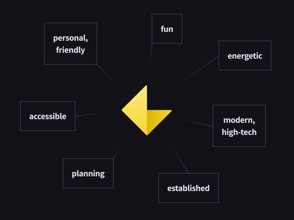
At Copyfolio, we speak like our audience: fast-paced, simple, and to-the-point. We use some (but not too much) slang and writer jargon - that’s why we’re so relatable. Our copy’s friendly and informal, but always striving to help, like talking to an experienced coworker friend.
As their friend, we’re caring and empathetic. We’re here to help them out, but understand their struggles and don’t make jokes on them when something goes wrong. We lift them up instead, with upbeat and fun copy to make a daunting task a breeze.
Our brand personality is:
- Clever but humble
- Youthful but professional
- Energetic but reliable
- Fun but not silly
- Helpful but not pushy
And that’s what we’re trying to convey in every single piece of microcopy we write. Let’s see how we do that.
Our process of writing branded microcopy
It’s not an easy job to integrate the brand’s personality into a few words that are already sharpened to guide and inform users. While we argued above why branded microcopy is important, there’s a boundary that limits our team while working on the copy. This limitation is the design context itself.
Our process starts with defining the UX goal of the copy and an initial draft that is considered “safe” to reach this UX goal. After this, we start to brainstorm on different approaches that add an extra layer to the words, often invoking relatable emotions, reactions. Although this is really invigorating, the result should still be within the “safe-zone” defined by our designer.
Summarized, copy and design affect each other during the design process and the real challenge is to find a delicate balance between them. Watch the chaos unfold with real examples from Copyfolio.
Examples of on-brand microcopy in Copyfolio
Every character counts
When it comes to UX copy, it’s important to keep in mind that every word and every character takes up valuable space. There were cases where we only had about 20 characters to introduce a feature in an interesting and catchy way.
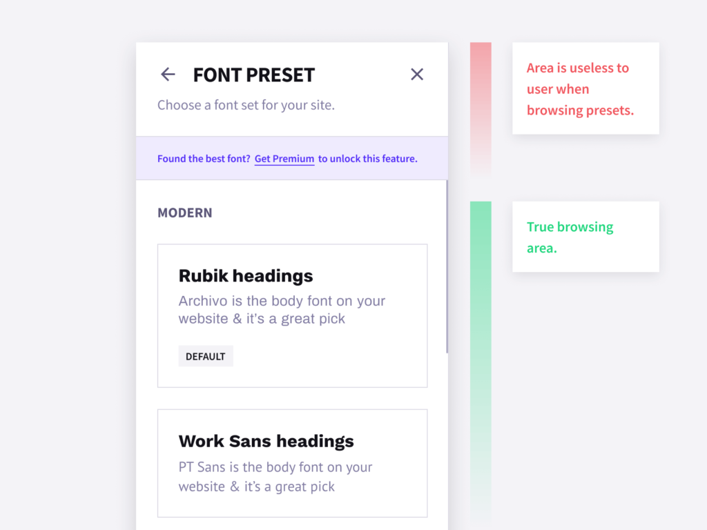
Let’s see our first example, the purple bar in the picture. It had to explain that the user is looking at a Premium-only but tryable feature, while taking up as little space as possible, allowing our users to browse fonts in a larger area. So, we went with a simple question that picks up the user’s thought process once they finish browsing: “Found the best font? Get Premium to unlock this feature”.
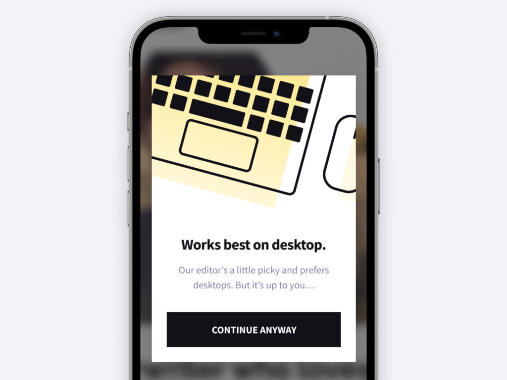
Another good example is a phone screen. The copy has to be concise and there’s little space for branding elements. We still felt that our brand personality would be conversational in this scenario so we kept twisting and juggling words until we settled on a casual but short and on-point approach that tells the user in a playful way that they might want to snap out their laptops to continue.
Casual copy eases tense situations
Talking about casual tone… It comes really handy when users are frustrated. The perfect example is an error message that blocks the way and they can’t finish up what they wanted to. Adding a jesting, personal style takes off the edge of the unpleasant experience.
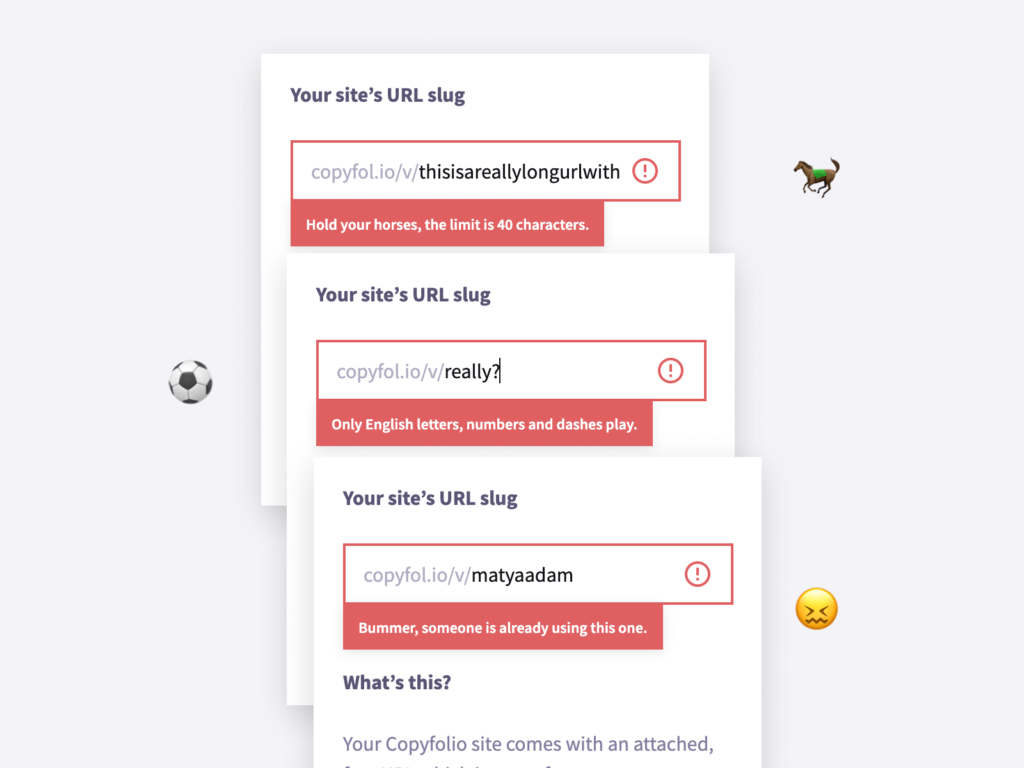
Getting the third error message in a row can be pretty irritating, especially if it feels like you’re dealing with a soulless robot. That’s why we decided to go playful with our error messages while keeping them informative enough so users can figure out what’s wrong.
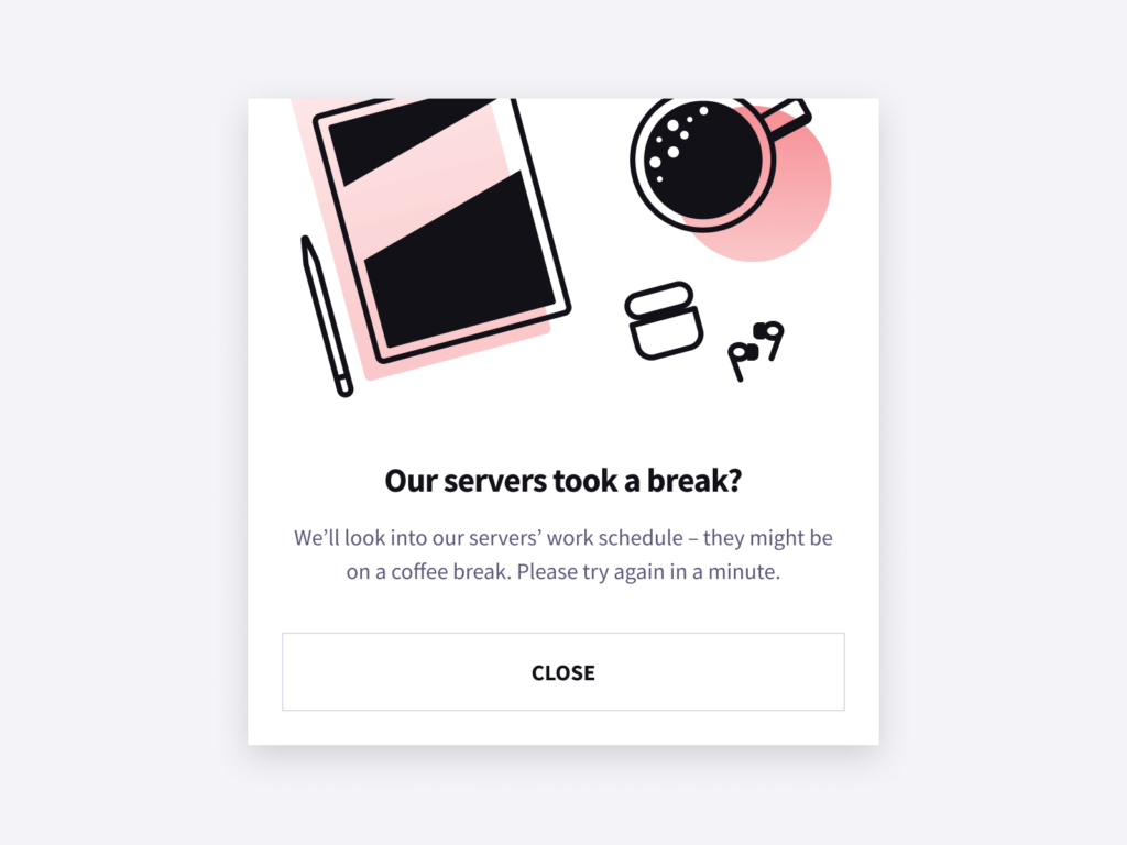
Accidents happen and it’s human to make mistakes. Sometimes our servers get overloaded and our users can’t reach their sites for a few moments. To ease this tension, we wanted to paint a picture of an overworked server who just needed to take a coffee break. Coffee breaks are short, so it makes sense that it’ll take only a minute to get back on track.
Staying motivated is way easier together
Microcopy is not only good to dissolve uncomfortable situations – it’s perfect to help someone out. Ever had the experience when someone kept pushing you out of your comfort zone and you’ve achieved something great? You can do just that with your words if you place them well.
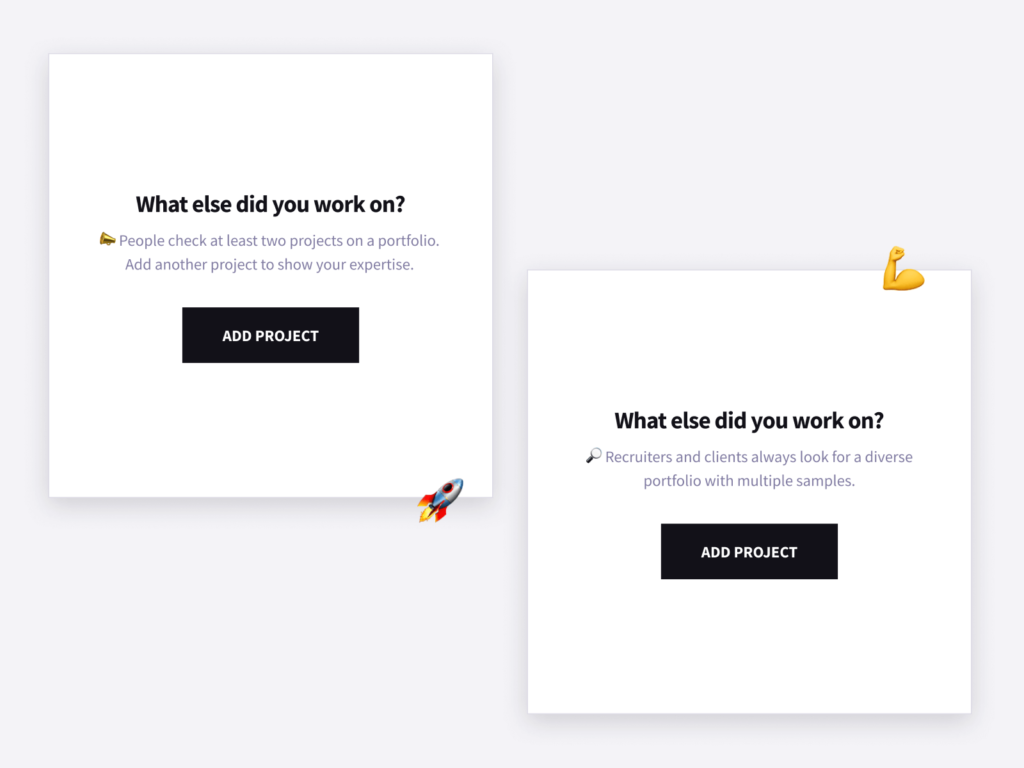
Starting your first case study or project is a good example here. You’re sitting in front of the screen and don’t know what to do. All it takes is a little bit of a reminder of what you’re working for. So, we’re trying to motivate our users to start (or keep) adding projects by highlighting our findings from our interviews with agency professionals and HR people.

Our brand is a friend, a helpful and joyful companion in site-building. Aligned with that, we say something uplifting to jog our users’ imagination – especially when they just start their journey in website building. We wanted to empower their creativity, to boost their confidence to build the website of their life.
At the end of the day, our goal is to help our users navigate through Copyfolio and have as much fun in the process as possible. Through the collaboration of design and copywriting, with branded microcopy, we’re striving to achieve that at every step of the way.
So if you’re a writer looking to create a portfolio website, and want to do it as quickly and easily as possible, check out Copyfolio. We guarantee the speed, ease of use, and fun pieces of microcopy along the way.
Did you know that we have a plethora of resources to help you build your portfolio? Check out our other articles if you need to build a copywriting portfolio, marketing portfolio, or journalism portfolio!


