How to Add Credibility to Your Portfolio: Logos, Testimonials & More
Anyone can say anything on the internet these days. So especially when it comes to your portfolio website, it’s important to back up what you say. You can do it two ways: prove your expertise with your samples, or try to build credibility.
In this post, we’ll show you how to do just that. With quick and simple how-to guides, we’ll make it easy and effortless. Let’s get started!
Why credibility is important for your portfolio
As we mentioned in the beginning, in the age of limitless and unchecked content, proving that you’re legit is essential. But even more so, when it comes to your personal portfolio website. Why?
Firstly, because this website is your personal representation online. So if it seems sketchy, or even just “too good to be true”, that’ll harm your own reputation. As an extension of your online identity, you need to make sure people not only read how awesome you are but believe it too.
Secondly, hiring you wouldn’t be a casual decision for whoever visits your site. No, it’s serious business. And as with anything they’d invest in, it’s only natural that they want to make sure they can trust the content.
But don’t worry, as long as what you publish is indeed true, there are multiple ways to ensure site visitors of that too, such as:
- Showcasing the logos of clients and companies you’ve worked with
- Displaying testimonials of clients, colleagues, and supervisors
- Presenting your projects and showing samples of your previous work
We’ll now go through how to do each now.
How to showcase client logos on your website
First, let’s talk about where you should add those client logos first. The best placement for them would definitely be your portfolio website’s homepage. That’s the one with the highest visibility of all your pages —and it makes sense to showcase something so important.
You can insert them underneath your tagline and/or short bio, or right above your highlighted top projects as well. Alternatively, you can add them to your about or services pages too.
Here’s how to easily display them in Copyfolio
In Copyfolio, you’ll find a dedicated section for this purpose, aiming to make adding logos as smooth and efficient as possible.

- Click on the “Add section” button in the editor to get started
- Choose “Logo wall” from the options
- Hover over each placeholder logo and click “Change image” to upload a real one instead
Want to rearrange them? Just grab them by the top and drag them wherever you want them to be.
Unified logo colors in Copyfolio
You might also notice that the logo colors are different at first. That’s because, by default, Copyfolio unifies them to match the color palette of your website. This ensures a professional, and cohesive feel.
Don’t like the look of that? You can switch it off easily to set the logos back to their original colors.

Here’s how:
- Hover over the right side of the Logo wall section
- Click on the “Section settings” button
- Under “Logo colors”, switch the setting over to “Original”
How to display testimonials on your portfolio site
Another great way to add credibility would be showing testimonials and recommendations from your previous clients, colleagues, and supervisors.
Perhaps not surprisingly, Copyfolio has a dedicated section for this purpose too.

Here’s how to use it:
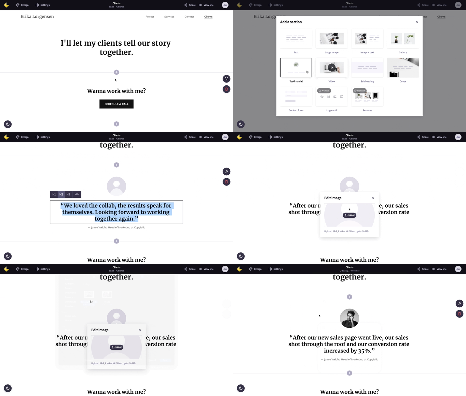
- Click on the “Add section” button in the editor
- Choose “Testimonial’ from the options
- Simply paste the review in the main text part and write who said it underneath
- Hover over the circular image placeholder and click “Change image” to upload a photo or logo
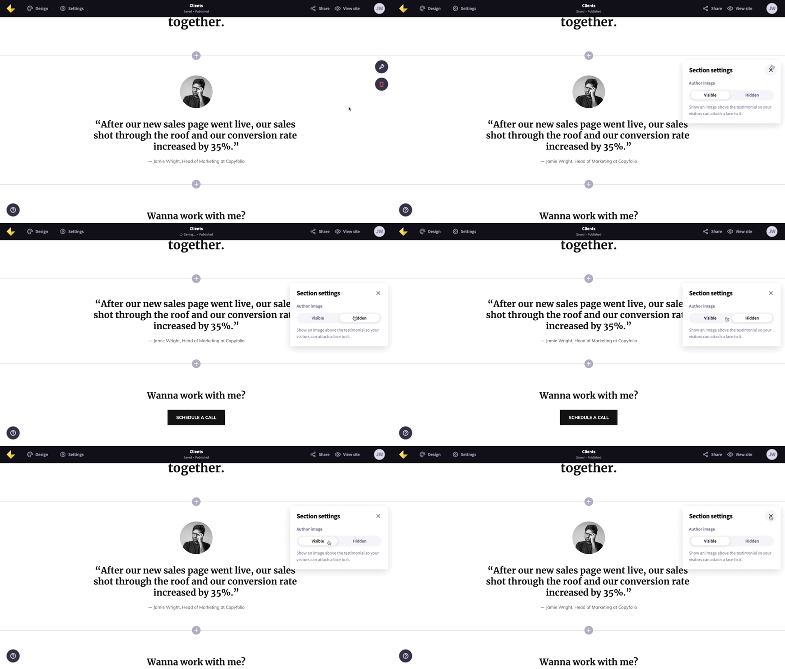
If you don’t want to include a photo with the testimonial, you can hide it in the section settings.

How to showcase your projects in your portfolio
Whenever it comes to portfolio websites, we always recommend showcasing at least your top projects right on your homepage. This way visitors won’t have to click around to find what they were looking for, making navigating your site that much easier.
Add a project grid or projects section
The most popular method for showcasing your projects on your homepage is using a grid of some sort. This means that you have thumbnail images in multiple columns (two, three, or four), each representing a separate project.
In Copyfolio, a projects section is automatically added to your homepage —all you have to do is click on the “Add project” button to add all of yours in.

Here’s a little more detailed run-down on how:
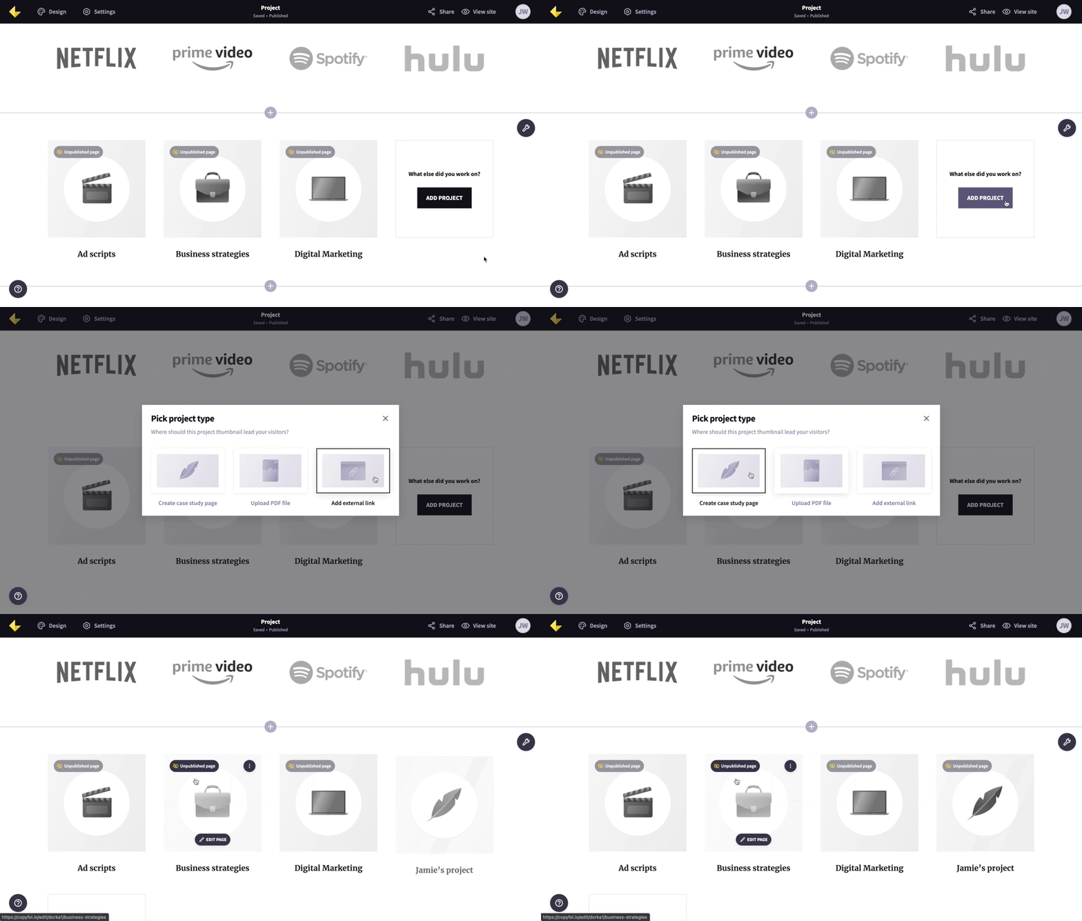
- Scroll down to the project section and click “Add project”
- Choose one of the project types: case study page, PDF, or external link
- Write the page, upload the file, or add the link
- Set a thumbnail for the project
- Publish the project so that others can see it too
As you can see, there are three project types. Creating a case study page means creating a new page on your website, that you can visit by clicking through the thumbnail. If you upload a PDF file, then it’ll open in a new tab in your browser —just like the external link. The thumbnail will take you there.
Just don’t forget that no matter the project type, it has to be published to be seen by others too.
How to create a portfolio website easily with Copyfolio
Don’t have a portfolio website yet to implement all these tips? You can create one quickly and easily with Copyfolio.
Signing up takes literally two minutes —just enter your name, choose your occupation, select a template, and off you go! We’ll be waiting for you on the other side with a basic site already set up for you.
Your portfolio website will come with pre-filled sections that have either examples or guiding questions, to give you an idea of what to write and where. At first, it’s set up with a homepage and two others, usually about and contact, but it depends on the template you choose.
But you can always add more, both sections and pages, and customize your site to perfectly fit your style and personal brand. To make design and customization faster and easier, Copyfolio has global palettes and preset that’ll apply your changes cohesively everywhere on your site.
You also won’t need to worry about setting the right padding and white space —it’s built in a way that’ll automatically look good for you. On every device.
Sounds like what you were looking for?
Create an account for free and take Copyfolio for a spin today!


